Charts

How to Make Candlestick Chart in Google Sheets (5 Quick Steps)

Graphs and charts are excellent visualization tools that provide you with a high-level overview of your data and enable you to draw conclusions. One ...

How to Print a Chart in Google Sheets (3 Simple Ways)

Google Sheets will not only help you to analyze a huge range of data but also provide the easiest way to the visual representation of data through ...

How to Change Color of Bar Graph in Google Sheets (Easy Steps)

Bar graphs are commonly used to display data in a visual format. Sometimes the default colors of a bar graph may not be the best fit for your data or ...

How to Insert a Legend in Google Sheets (With Easy Steps)

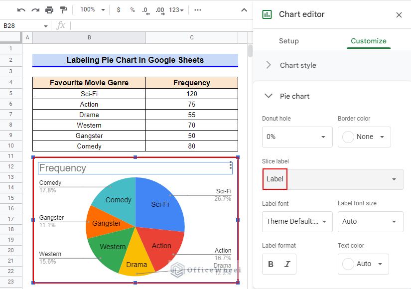
Users of Google Sheets have access to a wide range of chart types to assist them to visualize their data. However, simply displaying a chart with a ...

How to Change Pie Chart Colors in Google Sheets

In Google sheets, you can present your data with great visual formatting by inserting charts. You can add and change the chart format in the easiest ...

How to Edit a Pie Chart in Google Sheets (5 Core Features)

Creating and editing pie charts in Google Sheets is a great way to visualize and understand data, particularly in the context of financial ...

How to Copy a Pie Chart from Google Sheets (5 Easy Ways)

Imagine you are working on data that represents sales or profit every month and you need to analyze those data and report the growth in percentage. ...

How to Create Aggregate Chart in Google Sheets (with Easy Steps)

Different charts can summarize and represent data in different ways. Using the aggregate chart option in Google Sheets we can create those useful ...

How to Change Title of Pie Chart on Google Sheets

Google Sheets offers a variety of visualization possibilities, the Pie Chart being one of them. Using this tool, you may display data and understand ...

How to Change Pie Chart Percentage to Number in Google Sheets

Suppose you are working on a dataset that contains every month's sales and you need to analyze this data. Imagine how hard it could be. Because if ...

How to Make a 3D Pie Chart in Google Sheets (With Quick Steps)

“A picture is worth a thousand words”. Charts, Graphs, or Diagrams are important for better presentation, and for a better understanding of a ...

How to Label Pie Chart in Google Sheets (With Easy Steps)

We often use Pie Charts to arrange and exhibit data as a percentage or part of a whole. Creating a pie chart in Google Sheets is very simple. You can ...

Pivot Table Chart Aggregation in Google Sheets (With Easy Steps)

Pivot Table is a multi-functional tool in Google Sheets. Its usage includes summarizing, analyzing, visualizing data, and so on. In this article, we ...

How to Make a Percentage Chart in Google Sheets (3 Ways)

There is a wide range of visualization tools accessible in Google Sheets. You can visualize data using these tools and understand how various data ...

How to Use a Custom Formula in a Google Sheets Slicer (An Easy Guide)

Since slicers are essentially a type of filter, there can arise situations where the user might need to customize the filter conditions to suit their ...

OfficeWheel
Logo