There is a wide range of visualization tools accessible in Google Sheets. You can visualize data using these tools and understand how various data components work together as a whole. The percentage is one type of data element. You may learn how to make a percentage chart in Google Sheets by reading this article.
A Sample of Practice Spreadsheet
You can copy the spreadsheet that we’ve used to prepare this article.
3 Ways to Make a Percentage Chart in Google Sheets
Simply defined, there are five different types of charts that may be created to display the percentage of data. The data criteria and data form mostly determine the structure of the data.
Additionally, we will show you how to edit each graph section by section. Check out the examples in the next part to have a better understanding of the concept.
1. Inserting Bar Chart
A graph with rectangular bars is called a bar chart. Typically, the graph compares various categories. There are three types of bar charts to present the percentage data.
1.1 Horizontal Bar Chart
Horizontal bar charts are those in which the grouped data are displayed horizontally in a chart with the aid of bars.
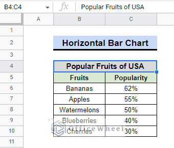
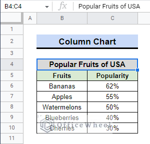
Suppose we have information on the most popular fruits in the USA. The vote is represented as a percentage. To create the bar chart, we will use the following data. Check out the instructions below.
Steps:
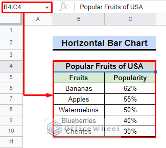
- We must once more choose the data range, which is B4:C10.
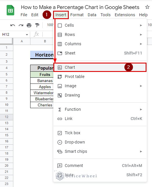
- Then select Insert > Chart.
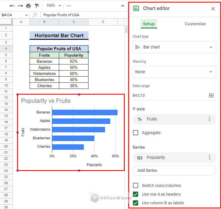
- Depending on the data, Google Sheets automatically suggested a horizontal bar chart.
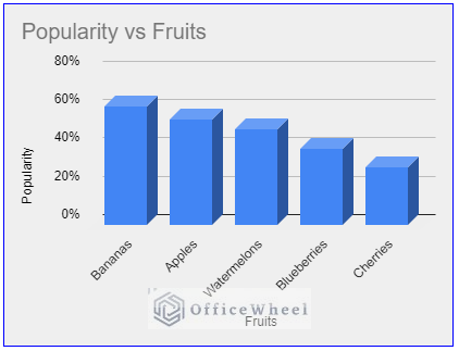
- However, we’d like to change the automatically generated title for the chart, which says “Popularity vs. Fruits“.
- To alter the title, use the Customise tab > Chart and axis titles option.
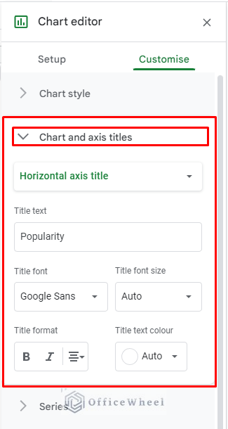
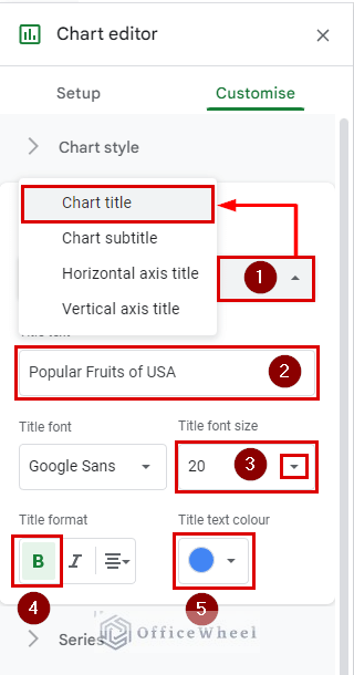
- By using the down arrow from the Title type selector, we need to change the “Horizontal axis title” to the “Chart title.”
- We shall put “Popular Fruits of USA” in the Title text.
- The Title font size box allows you to choose the title font size from Auto to 20.
- Select B under the Title format box to make the title bold.
- Consider that instead of Auto, the title text color will be Blue.
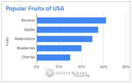
Finally, we will have the following bar chart with the title “Popular Fruits of USA” in bold and blue color, showing the percentages on the X-axis and the names of the fruits on the Y-axis. Using the same process, you can change the names of other titles.
Read More: How to Use TO_PERCENT Function in Google Sheets
1.2 Column Chart/Vertical Bar Chart
Vertical bar charts are graphs or charts that use bars to display grouped data vertically in a chart or graph, with the bars serving as a measure of the data.
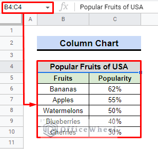
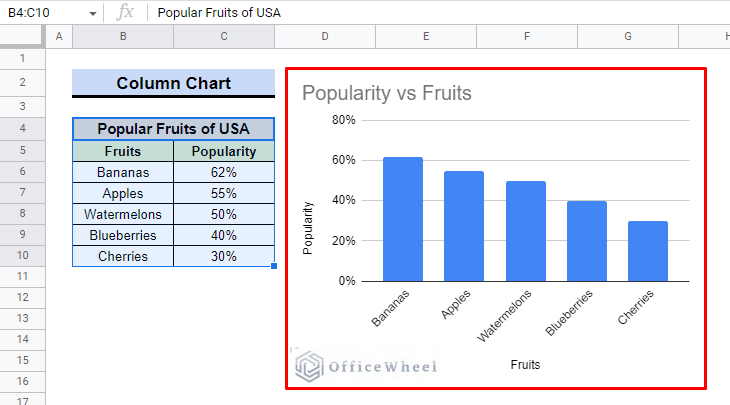
Take into account that we will once again create a column chart using the data of the most popular fruits in the USA. Check the steps below.
Steps:
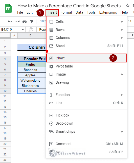
- We will first choose the data range. It’s B4:C10 in this instance.
- Navigate to the Chart option using the Insert menu on the toolbar in the second step.
- In the spreadsheet, we will discover two things. A Chart and a Chart Editor.
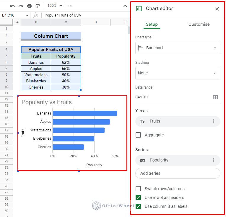
- Check the chart Setup now from the Chart editor. Depending on the dataset, it opened a Bar chart by default.
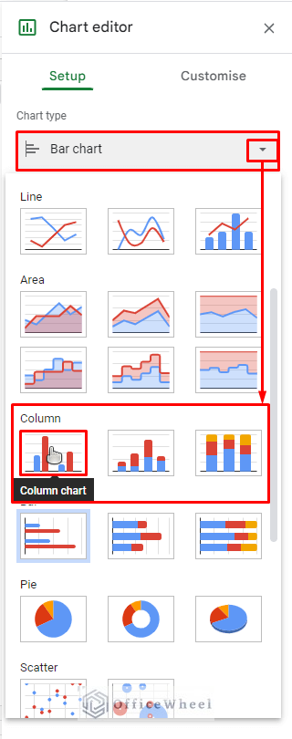
- We’ll choose the leftmost down arrow. There will be a list of Chart types in a drop-down menu that appears.
- At the bottom, choose the Column chart.
- We shall discover the column chart presented in the picture below.
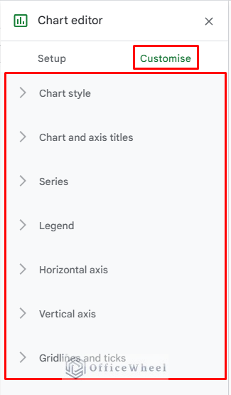
- The Customise tab in the Chart editor allows us to modify the chart as we see fit.
- A list of customization options will appear if we select the Customise tab.
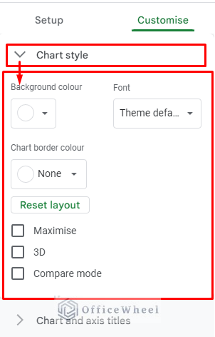
- Consider that we will modify the Chart style.
- When we select the Chart style, six viable options will appear.
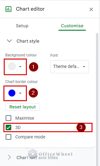
- For our experiment, we’ll only use a few options. The background color will now be Light Gray 2 instead of White.
- Instead of having no border, we will make it blue.
- Finally, we will select “✔” the 3D option to improve the data visualization.
By the time we’re done, we’ll have a column chart like the one you can see below. The Y axis of the column chart displays the percentage number, and the X axis lists the names of popular fruits.
Read More: Google Sheets Calculated Field Percentage of Total in Pivot Table
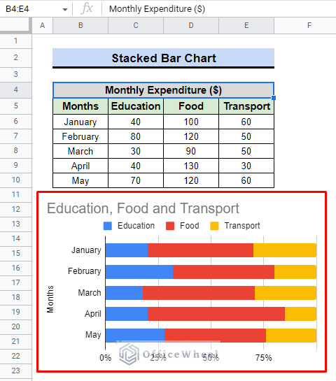
1.3 Stacked Bar Chart
The stacked bar graph separates the data into many groups. This style of bar graph allows for the representation of each component using a different color, making it easier to distinguish between the many categories.
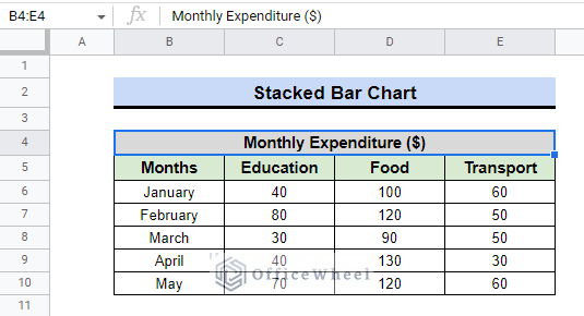
Consider that we already have information on the monthly expenses of a student. To display the data graphically, we will utilize a 100% stacked bar chart.
Steps:
- In the beginning, we must choose the data range. In this case, it is B4:E10.
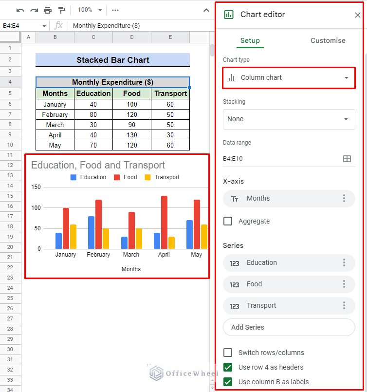
- Then select Insert > Chart.
- The spreadsheet will by default display a column chart with a Chart editor.
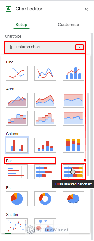
- Choose the 100% stacked bar chart from the Chart type drop-down menu in the Bar section.
- This stacked bar chart will then appear after the chart has been updated.
- In the series, we intended to display the data labels, i.e., Transportation, Food, and Education.
- Select the Series section under the Customise tab. There will be a drop-down window with some features.
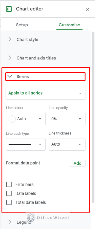
- To display the data on the chart, we will check “✔” the Data labels.
- When we select the Data labels, a new segment for customization will appear.
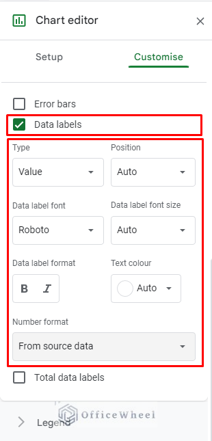
- We’ll move the labels from the Auto to the Centre position.
- To make the data bold and italic in form, we will select both options on the data label format.
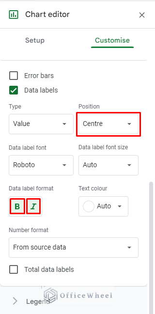
- After that, a stacked bar chart with data labels is what we find.
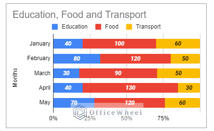
As you can see, the chart outlines the monthly costs associated with each condition. For instance, the cost of education in February and May is unquestionably greater than 25% of overall expenses, although it is less than 25% in most other months.
Read More: How to Calculate Percentage in Google Sheets (4 Ideal Examples)
2. Applying Pie Chart
A pie chart is a form of a chart that represents data in a circular graph. The most common way to display percentage data is on a pie chart.
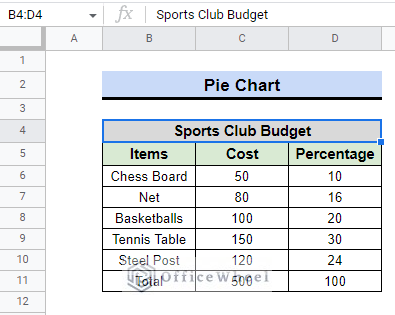
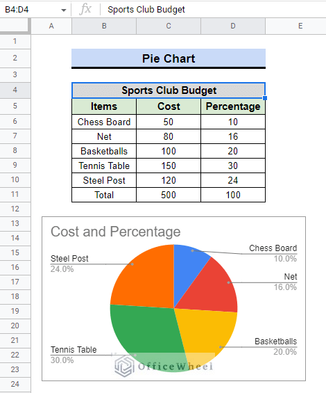
Let’s say we have information on the current budget of a sports club. We must outline the intended use of the fund as well as the total expenses.
Steps:
- First, we need to select the data range B4:D11.
- Select Insert > Chart after that.
- Depending on the data, Google Sheets will automatically create a column chart, and we can find the Chart editor right next to it.
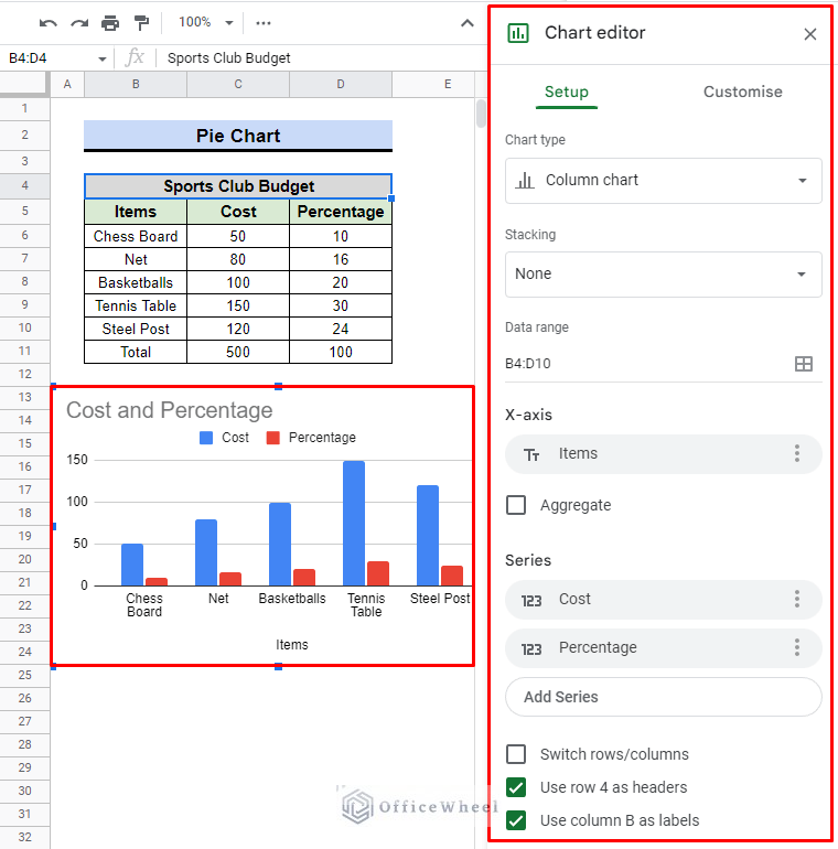
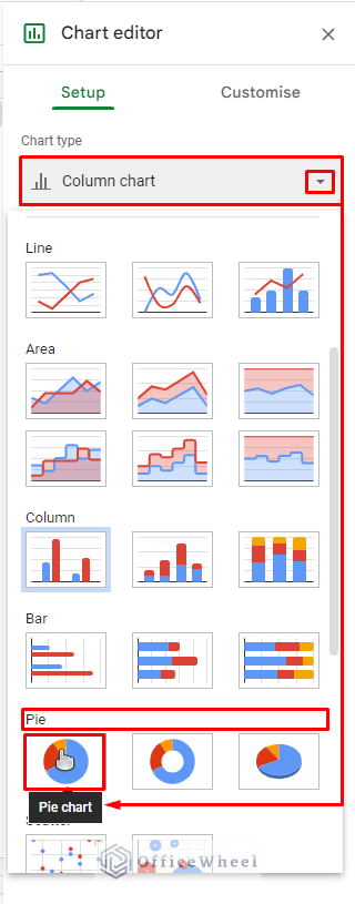
- However, using the chart editor, we will make a pie chart., for instance. Check the Pie Chart option under Chart Editor > Setup > Chart Type.
- The column chart will be gone, and the following pie chart will appear in its place.
- We’ll use the Customise tab to make it more attractive and representative.
- We will have the following 5 options for the pie chart under the Customise column.
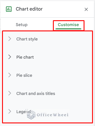
- By selecting the Pie chart option, we will begin customizing. When we click it, it expands and presents us with the following choice.
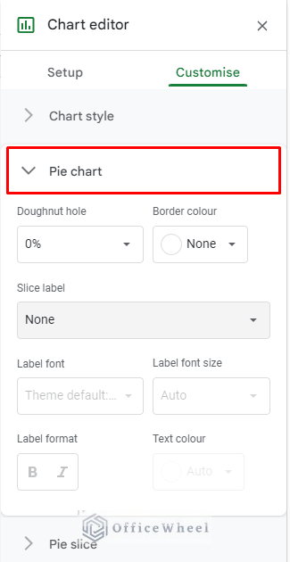
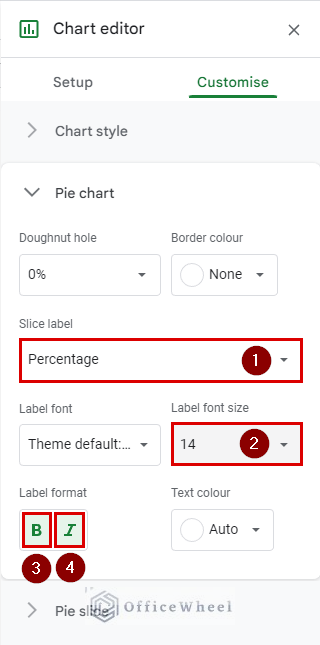
- We’re going to switch the Slice label from None to Percentage.
- Consider using 14 as the Label font size rather than None.
- When choosing a Label format, we’ll use both bold and italics.
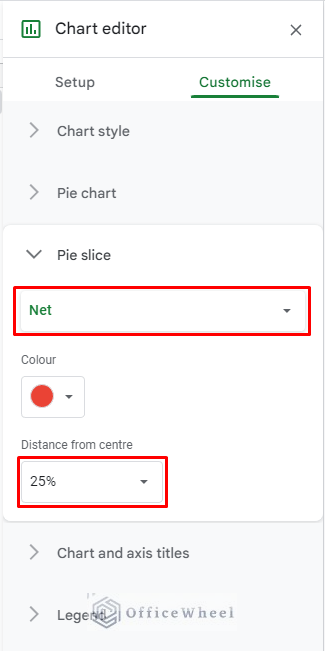
- We will choose the Net as the slice option in the next section of the Pie slice.
- Set the distance from the centre to 25%.
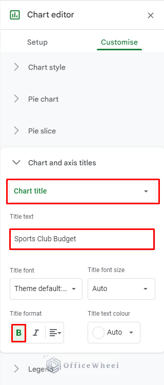
- We will now alter the Chart Title under the section titled “Chart and axis titles“.
- You will notice that the old title was Cost and Percentage if you look very carefully. By choosing the Chart title first, we will make changes to it.
- We shall type Sports Club Budget in the Title text.
- For the Title format, don’t forget to click the B to make the text bold.
- After customization, we will have the pie chart below.
To summarize, we utilize the pie chart to update the labels, the pie slice to accentuate variation in the chart by moving the net slice 25% out from the centre, and the chart and axis title to create a more meaningful title for the chart.
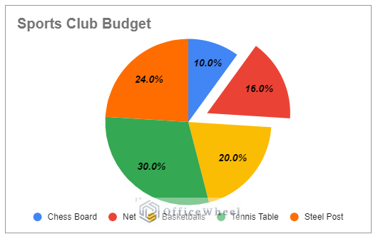
We can now clearly understand their intended use for the fund. For instance, their budget for purchasing a chess board is the lowest at 10% of the overall budget. A tennis table will be purchased with the majority of the money, which accounts for 30% of the whole budget. In Google Sheets, people typically use pic chart to make percentage data visually representable.
Read More: How to Change Pie Chart Percentage to Number in Google Sheets
3. Using Pareto chart
A Pareto chart is a statistical chart that combines line and column charts. Google Sheets does not come with a Pareto chart by default, but we can add one by using the Combo chart.
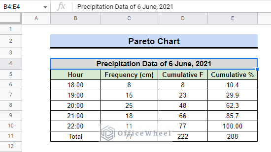
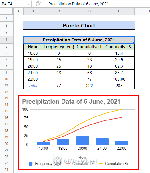
Charts like the Pareto chart are frequently used in engineering and scientific works to explain relationships and findings. Consider, for instance, that we have data on precipitation that will be used to generate a precipitation hydrograph to display the increasing level of precipitation by the hour.
Steps:
- Choosing the B4:E11 range is necessary once again.
- Then, using the Insert menu in the toolbar, navigate the Chart once again.
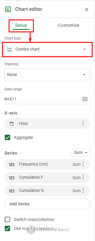
- As you can see in the following image, Google Sheets created a Combo chart based on the data.
As a result, the Pareto chart will display the amount of precipitation as blue column bars. The line graphs, where the red line indicates the cumulative frequency and the orange line represents the cumulative percent, demonstrate the rise in precipitation level by the hour.
Therefore, if it seems essential, you may also make a combo chart in Google Sheets utilizing percentage data.
Read More: How to Calculate Percentage Increase in Google Sheets (4 Ways)
Final Words
You can make whatever chart you want using percentage data. Therefore, it is a good idea to familiarize yourself with all the charts that Google Sheets provides. In this article, we attempted to demonstrate how to create a percentage chart using Google Sheets. Hope that was most helpful to you. Please leave a comment if you have any questions. Check out OfficeWheel for more useful articles.