We often use Pie Charts to arrange and exhibit data as a percentage or part of a whole. Creating a pie chart in Google Sheets is very simple. You can simply select two columns and insert a pie chart from the Insert ribbon. But this pie chart will only contain the chart title and legends by default. Sometimes, we require labels on the slices of the pie too. In this article, I’ll discuss a step-by-step procedure of how to label a pie chart in Google Sheets. Afterward, I’ll also demonstrate how to customize a label for any pie chart in Google Sheets.
A Sample of Practice Spreadsheet
You can copy our practice spreadsheets by clicking on the following link. The spreadsheet contains an overview of the datasheet and an outline of the demonstrated steps of how to label a pie chart in Google Sheets.
Step-by-Step Process to Label Pie Chart in Google Sheets
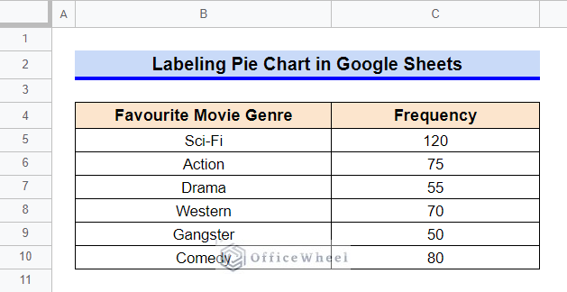
First, let’s get familiar with our dataset. The dataset contains a list of movie genres and the frequency of people that prefer those movie genres. We’ll create a pie chart for this dataset and then demonstrate how to label that pie chart in Google Sheets.
Step 1. Create a Pie Chart
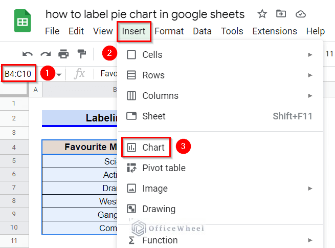
- First, select the range B4:C10 and then go to the Insert ribbon.
- Afterward, select Chart from the appeared options.
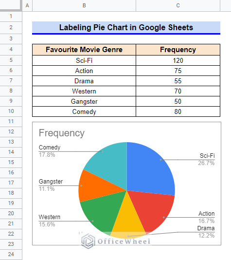
- Since the data is of nominal type, Google Sheets will create a default pie chart like the following. If any other type of chart appears, then change the chart type to Pie Chart from the sidebar setup.
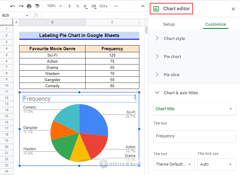
Step 2. Open Chart Editor
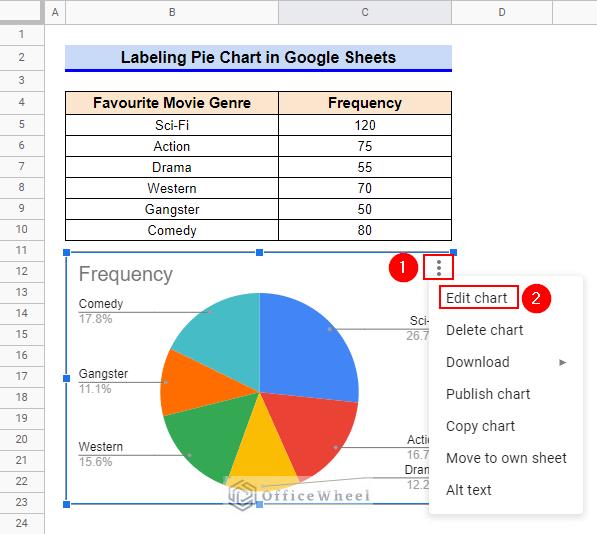
- Now, first, click on the chart to select it and then click on the vertical ellipsis (⋮) symbol from the top right corner of the chart, and then click on the Edit Chart option.
- A sidebar like the following will appear. Another way to open this sidebar is to simply double-click on the chart.
Read More: How to Edit a Pie Chart in Google Sheets (5 Core Features)
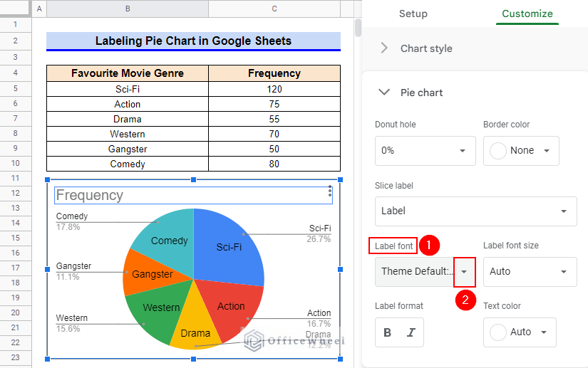
Step 3. Add Slice Label
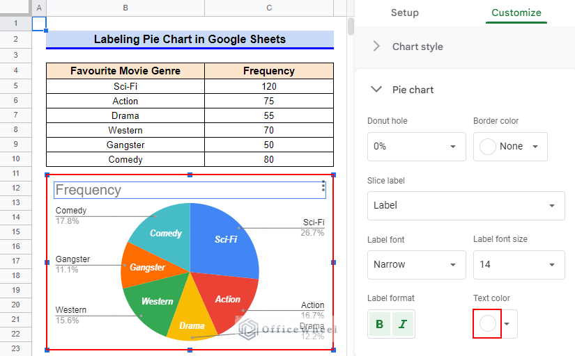
- Now, in Customize menu, first, select the option Pie Chart and then click on the drop-down icon of the Slice Label command.
- Afterward, select the Label option from the drop-down items.
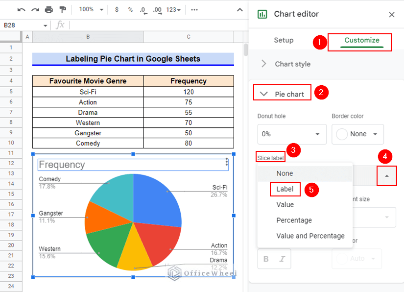
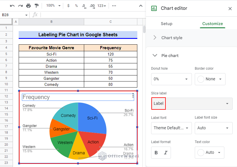
- Thus, you can add slice labels to a pie chart in Google Sheets. You can also try other slice label types like Value, Percentage, or a combination of Value and Percentage.
Read More: How to Change Pie Chart Percentage to Number in Google Sheets
How to Customize Label of Pie Chart in Google Sheets
After adding slice labels to the pie chart, you can also customize the font, size, format, and text color of the labels. Now, let’s get started.
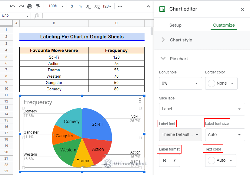
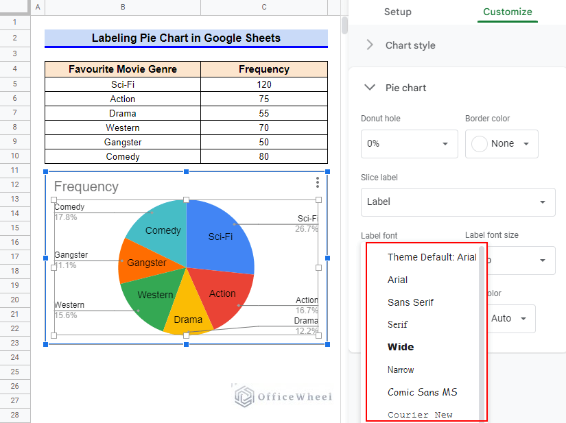
1. Switch Label Font
You can switch to any preferable font for the slice labels from the available font list. Keep reading to learn how.
Steps:
- Firstly, click on the drop-down icon of the Label Font command.
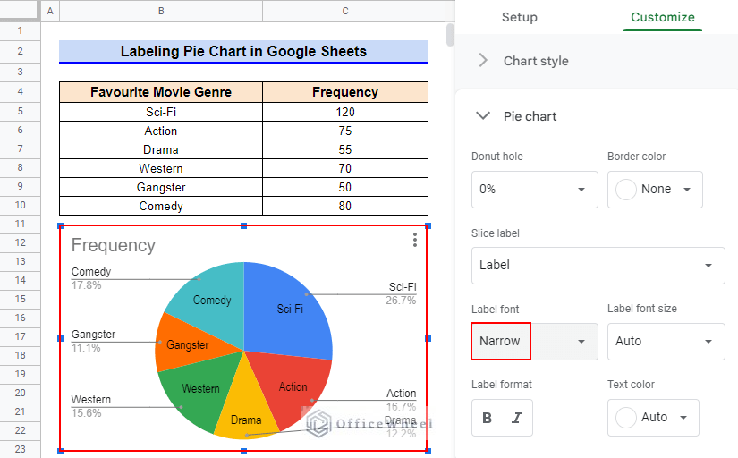
- A list of options like the following will pop up. Select your preferable font. I’ll be selecting the Narrow font.
- The slice label fonts will change like the following.
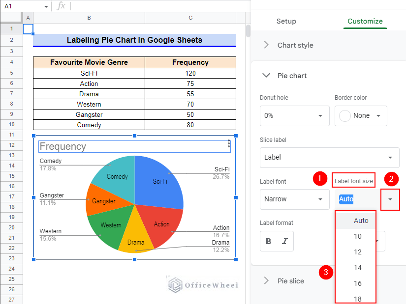
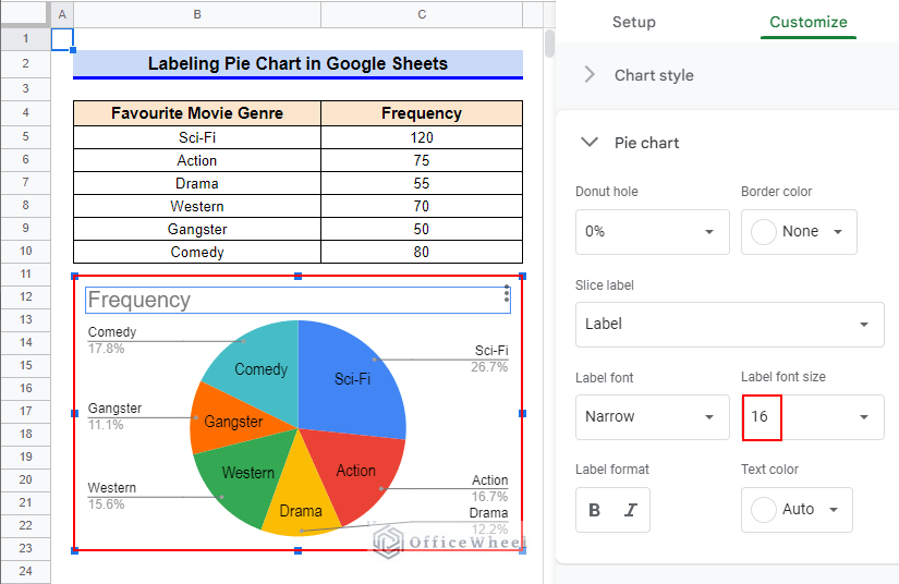
2. Change Label Font Size
You can also change the font size of slice labels as per your requirement. This customization is helpful if the label texts are very long or if the labels are not lucid enough for viewing.
Steps:
- Firstly, click on the drop-down icon of the Label Font Size command.
- Afterward, select your preferred font size from the dropdown list options. I’ll select 16 as my slice label font size.
- The slice labels now look like the following. The label texts are much more evident now.
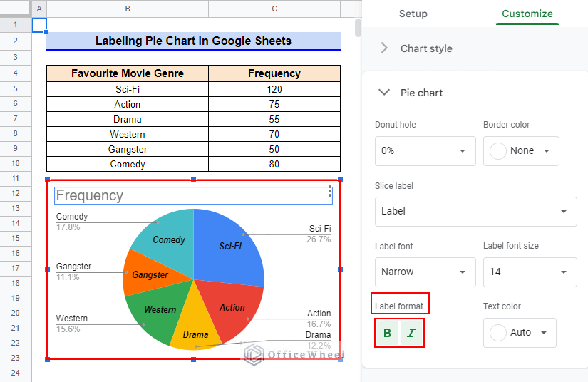
3. Modify Label Format
You may also require to modify the formatting of the label to make the labels more lucid. Keep reading to learn how you can modify the label formatting.
Steps:
- Simply click on the Bold and/or Italic formats according to your requirement. I’ll select both formats.
- The slice labels look like the following now.
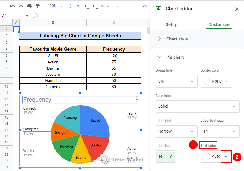
4. Edit Text Color
You may also require to change the text color of the slice labels in your pie chart. Read the following steps to learn how.
Steps:
- First, click on the drop-down icon of the Text Color command.
- A set of colors will appear. Select the color you prefer. I’ll select the White Theme Color.
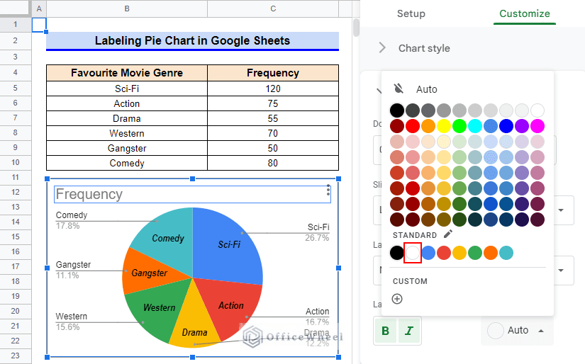
- The slice labels now look like the following in our pie chart.
Read More: How to Change Pie Chart Colors in Google Sheets
Things to Be Considered
- Google Sheets usually creates a default pie chart for a nominal or categorial set of data. However, if any other type of chart appears, then change the chart type to Pie Chart from the sidebar setup.
Conclusion
This concludes our article to learn how to label a pie chart in Google Sheets. I hope the demonstrated steps were sufficient for your requirements. Feel free to leave your thoughts on the article in the comment box. Visit our website OfficeWheel.com for more helpful articles.