Creating and editing pie charts in Google Sheets is a great way to visualize and understand data, particularly in the context of financial performance. Understanding how to edit a pie chart in Google Sheets can help users to customize the chart to their specific needs and make it more accessible to others. Editing pie charts in Google Sheets is a valuable tool for analyzing business performance.
A Sample of Practice Spreadsheet
You can copy our spreadsheet that we’ve used to prepare this article.
How to Create a Pie Chart in Google Sheets
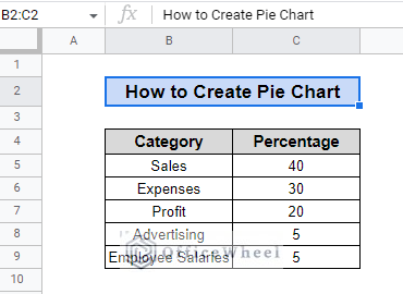
Google Sheets offers a user-friendly chart editor for creating and editing pie charts. Using the sample data provided with categories of Sales, Expenses, Profit, Advertising, and Employee Salaries. To create a pie chart in google sheets, check the following setup process.
Steps:
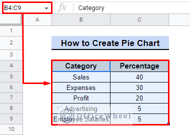
- At first, we select the data we want to use in the chart. For this instance, it is from cell range B4 to C9.
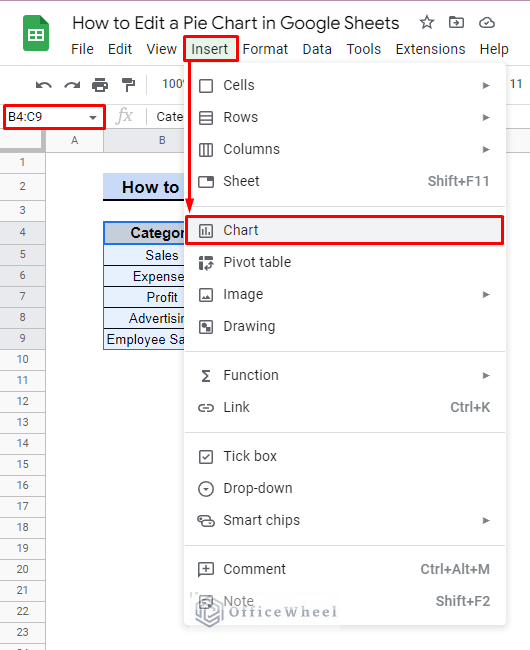
- Next, we go to the “Insert” menu and select “Chart“.
- The chart editor will automatically populate with the selected data and display a preview of the pie chart.
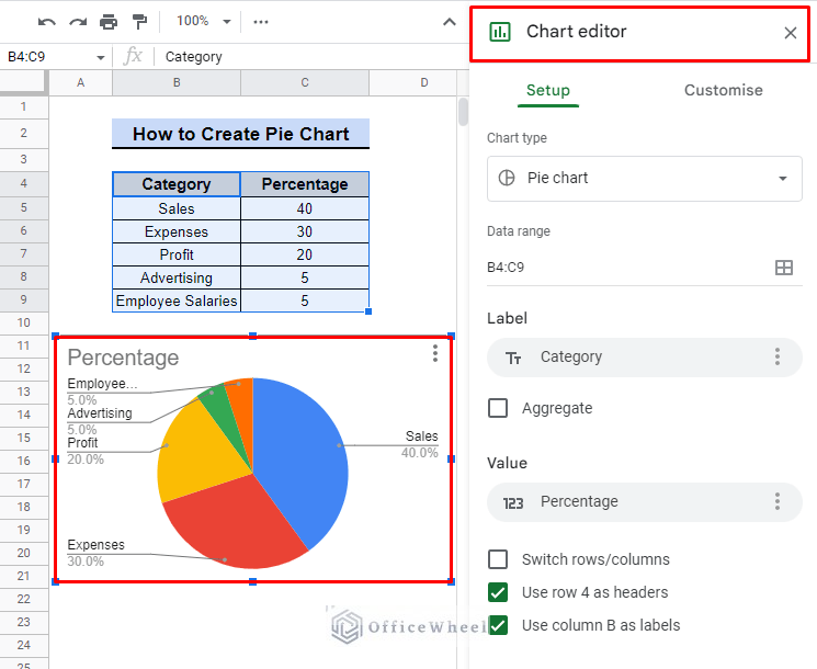
From here, you can use the various tabs and options in the chart editor to customise the chart to your liking, including adjusting the chart style, data, and labels.
5 Features for Editing a Pie Chart in Google Sheets
The following sections will describe the features of the chart editor in detail for how to edit pie charts in google sheets.
The Customize tab in the chart editor offers various options to customize the appearance of the pie chart. Provides context and clarity to the chart, enhance its visual appeal, and makes it professional.
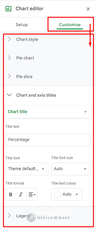
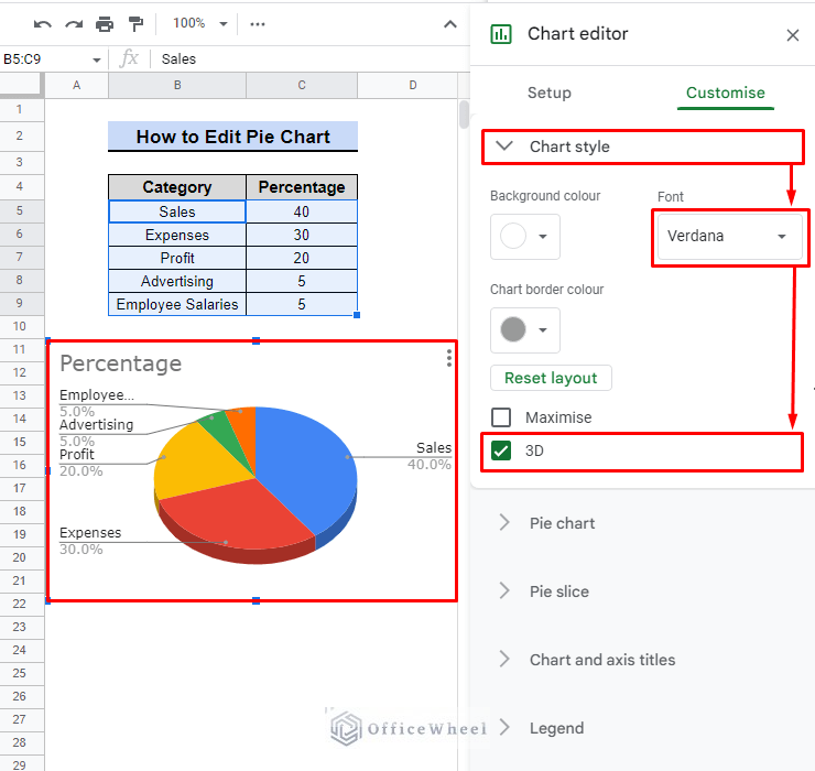
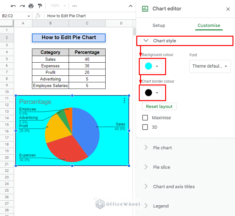
I. Chart Style
Allows the user to change the background color, add borders, and adjust the size of the chart. It is useful for enhancing the visual appeal of the chart and aligning it with the presentation or report design.
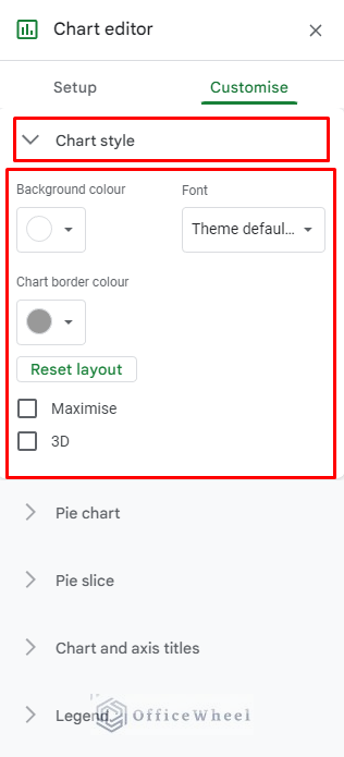
For this example, we are going to make two changes which are as follows.
- Chart style > Font > Verdana: This option changes the font to Verdana, a clear and easy-to-read font that makes the chart text more legible.
- Chart style > 3D: This option changes the chart to a 3D style, making it more visually appealing, which can make it more engaging and interesting for the audience, but it can make the chart less practical to read.
- Chart style > Background color > Cyan: Change chart background to cyan.
- Chart style > Chart border color > Black: Change the chart border color to black.
Read More: How to Make a 3D Pie Chart in Google Sheets (With Quick Steps)
II. Pie Chart
Allows the user to add or remove data, change the data labels, and adjust the colors of the chart. This feature is important for accurately representing the data and making it easy to understand for the audience.
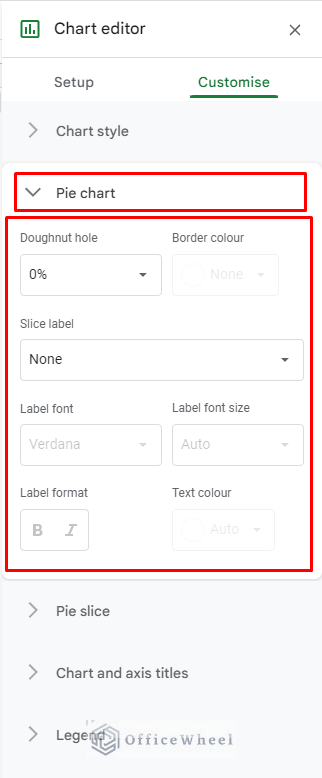
We are going to use the following option to customise the pie chart.
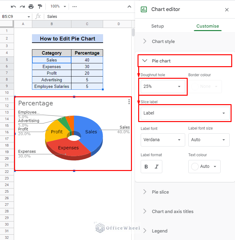
- Pie chart > Doughnut hole > 25%: This option allows you to add a hole in the center of the pie chart that represents 25% of the chart. This feature can be used to show the proportion of the data which is not represented in the chart.
- Pie chart > Slice label > Label: This option allows you to add a label to each pie chart slice to represent the data. This feature can be used to make the chart easy to understand and to provide context to the audience.
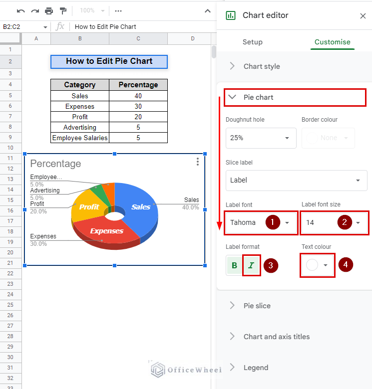
- Pie chart > Label font > Tahoma: Change the font of data labels to Tahoma.
- Pie chart > Label font size > 14: Adjust the font size of data labels to 14.
- Pie chart > Label format > Italic: Apply italic formatting to data labels.
- Pie chart > Text colour > White: Change the text color of data labels to White.
Read More: How to Label Pie Chart in Google Sheets (With Easy Steps)
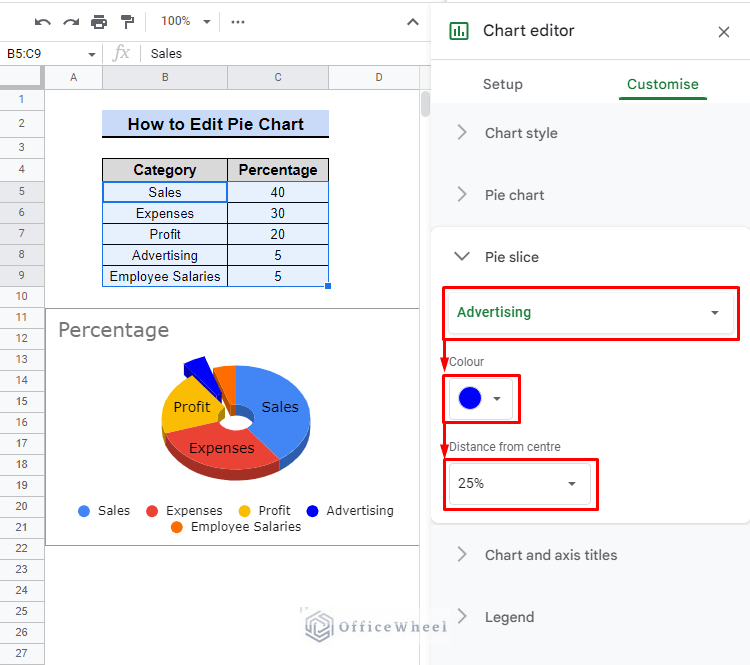
III. Pie Slice
Allows the user to adjust the size of each slice of the pie chart. This feature is useful for emphasizing or de-emphasizing certain slices of the chart to highlight specific data.
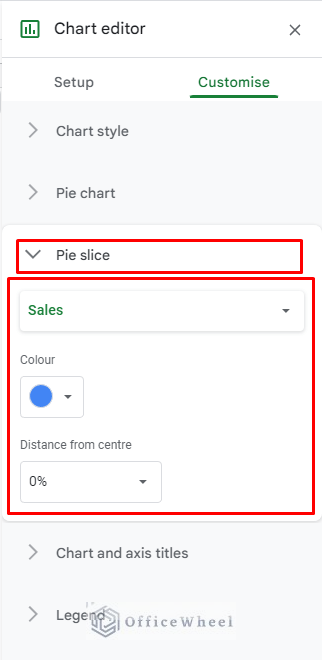
To demonstrate the features of Pie Slice we will use the following.
- Pie slice > Pie slice selector > Advertising: This option allows you to select the slice of the pie chart that corresponds to the “Advertising” category. Use this feature to make changes to the selected slice exclusively.
- Pie slice > Colour > Blue: This option allows you to change the colour of the selected slice to blue. You can use this feature to enhance the visual appeal of the chart and draw attention to important data.
- Pie slice > Distance from center > 25%: This option allows you to adjust the distance of the selected slice from the center of the chart by 25%. You can use this feature to emphasize or de-emphasize the selected slice and highlight important data.
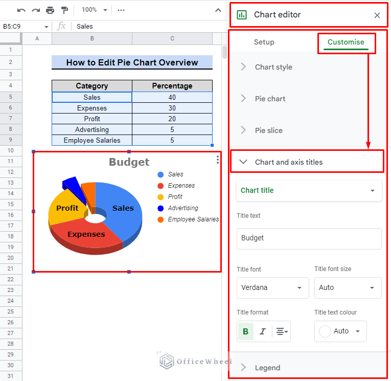
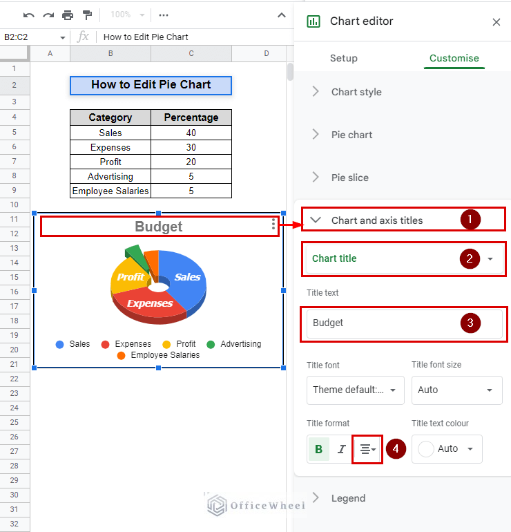
IV. Chart and Axis Titles
Allows the user to add or edit the chart title, axis titles, and gridlines. This feature is useful for providing context to the chart and making it easier to understand for the audience.
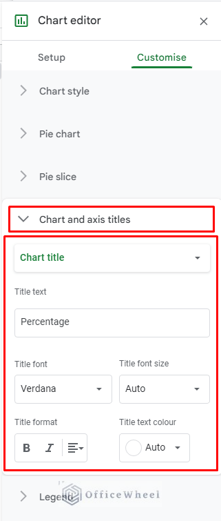
To illustrate the capabilities of the Chart and axis titles feature, we will employ the following.
- Chart and axis titles > Title type selector > Chart title: This option allows you to select the title type of the chart, in this case, the Chart title.
- Chart and axis titles > Title text > Budget: This option allows you to add or edit the text of the title, in this case, the title text is set to “Budget“.
- Chart and axis titles > Title format > Bold: This option allows you to apply bold formatting to the title text, making it more prominent and attention-grabbing.
- Chart and axis titles > Title format > Center alignment: This option allows you to align the title text to the center of the chart, making it more visually balanced and easy to read.
Read More: How to Change Title of Pie Chart on Google Sheets
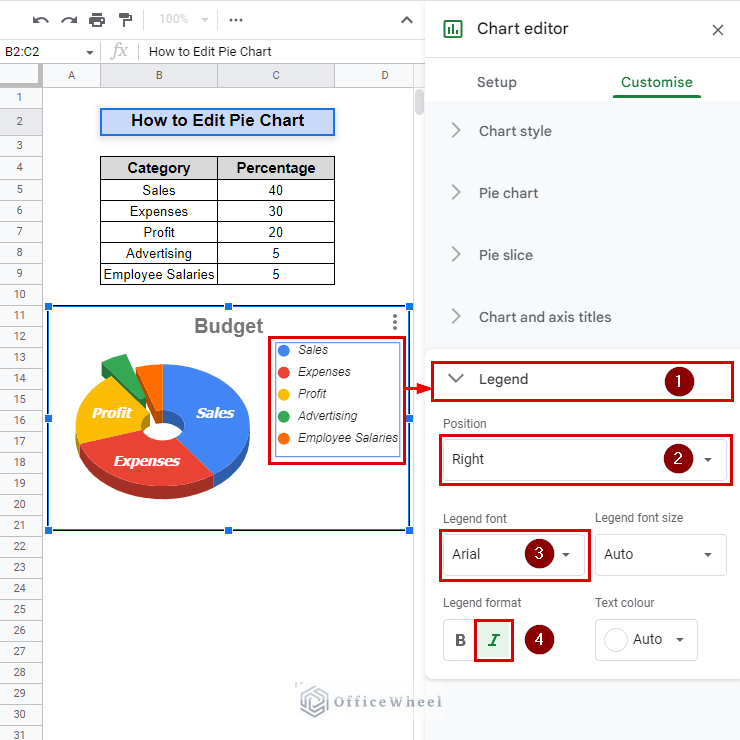
V. Legend
This feature enables the user to add, position, and edit the legend entries of the chart. This feature provides additional information about the chart such as the meaning of colors and symbols.
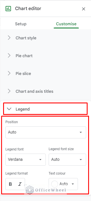
The following will be utilized to showcase the functionality of the Legend feature.
- Legend > Position > Right: This option allows you to change the position of the legend to the right side of the chart. Make the chart more visually balanced and easy to read.
- Legend > Legend font > Arial: This option allows you to change the font of the legend to Arial. Arial is a widely used font that is known for its readability and versatility. Choosing Arial font will give your legend a clean, modern, and easy-to-read appearance.
- Legend > Legend format > Italic: This option allows you to apply italic formatting to the legend text, making it more prominent and attention-grabbing. we use it to emphasize the important information in the legend.
Conclusion
In conclusion, understanding how to edit a pie chart in Google Sheets is crucial for effectively analyzing business performance. Customizing and making data-driven decisions using pie charts in Google Sheets can improve financial performance and business success. Check OfficeWheel for more professional help.