“A picture is worth a thousand words”. Charts, Graphs, or Diagrams are important for better presentation, and for a better understanding of a specific topic. They present information visually. Since trends and correlations may sometimes be seen clearly on charts, graphs, or diagrams, they can make comparing different sets of data much simpler. And when it comes through a 3D visualization, the understanding process becomes much more simpler. In this article, we have demonstrated step-by-step procedures to make a 3D pie chart in Google Sheets.
A Sample of Practice Spreadsheet
Step-by-Step Process to Make a 3D Pie Chart in Google Sheets
Making a 3D pie chart is easy. Just go through the following steps to make a 3D pie chart in Google Sheets.
Step 1. Make a Dataset
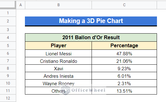
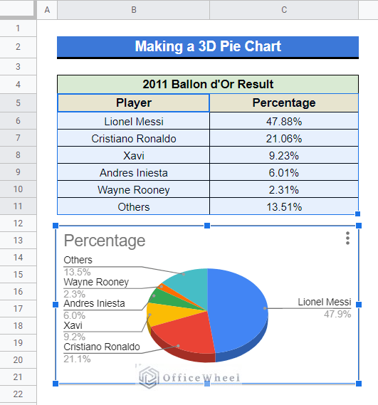
First of all, to make a 3D pie chart, you will need a dataset. For example, we will use the following dataset here. The dataset represents the 2011 Ballon d’Or list with the players winning probabilities.
Step 2. Insert Chart
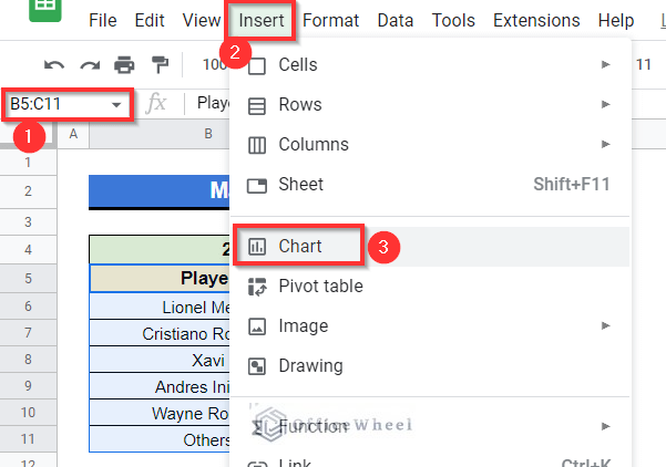
- First, select Cell range B5:C11, go to the toolbar menu and select Insert. Then select Chart.
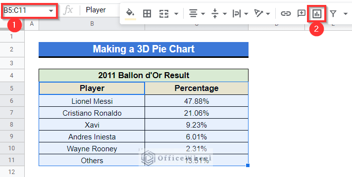
- Or you can simply use the “Insert chart” option from the toolbar.
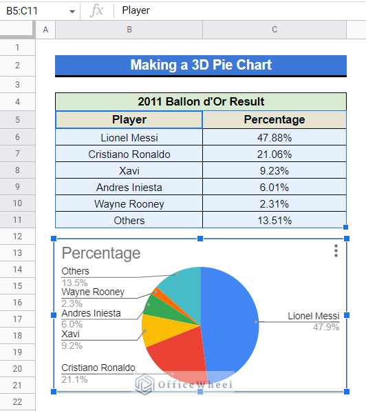
- After that, a pie chart will appear on your dataset.
Step 3. Change Chart Type
- At the top right of the pie chart select the vertical ellipsis (⋮) option then select “Edit chart”.
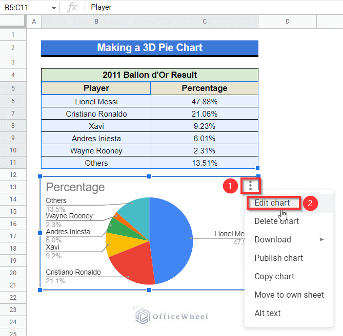
- Or you can simply left-click on the chart twice.
- A sidebar will appear on your dataset titled “Chart editor”.
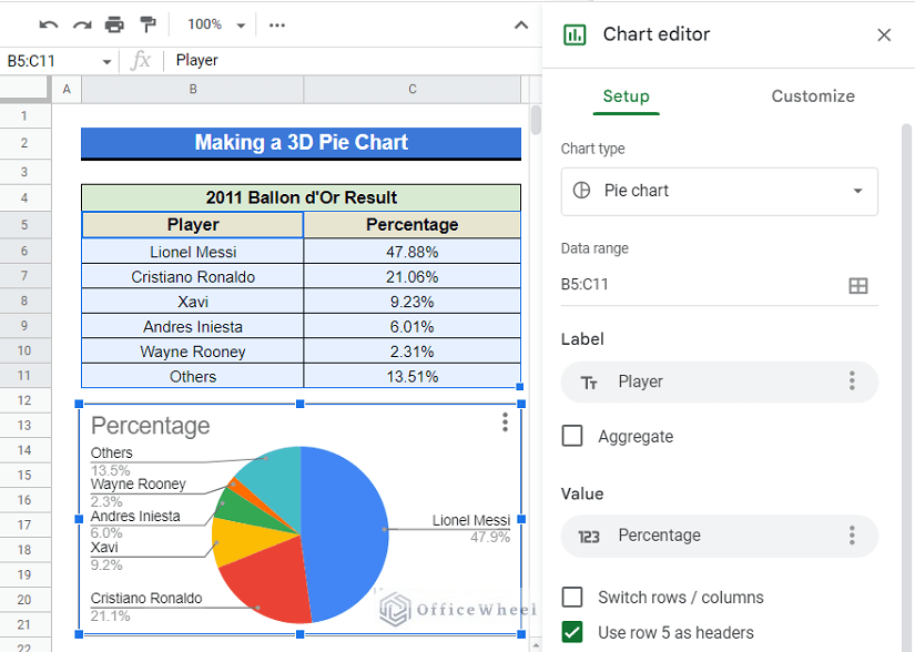
- In the sidebar, from the Setup section, select the Drop down menu of chart type and then select “3D pie chart”.
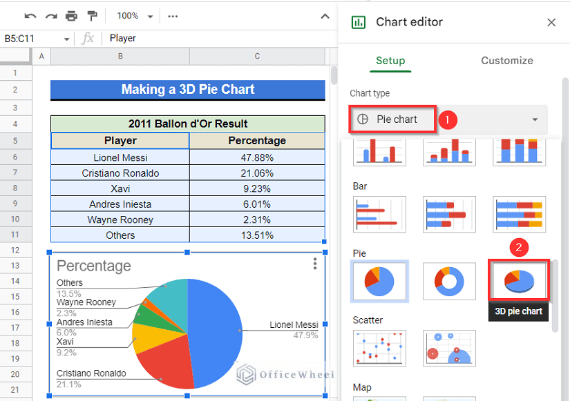
- Or you can select the “Customize” option in the sidebar then select “Chart style” and then mark the “3D” box.
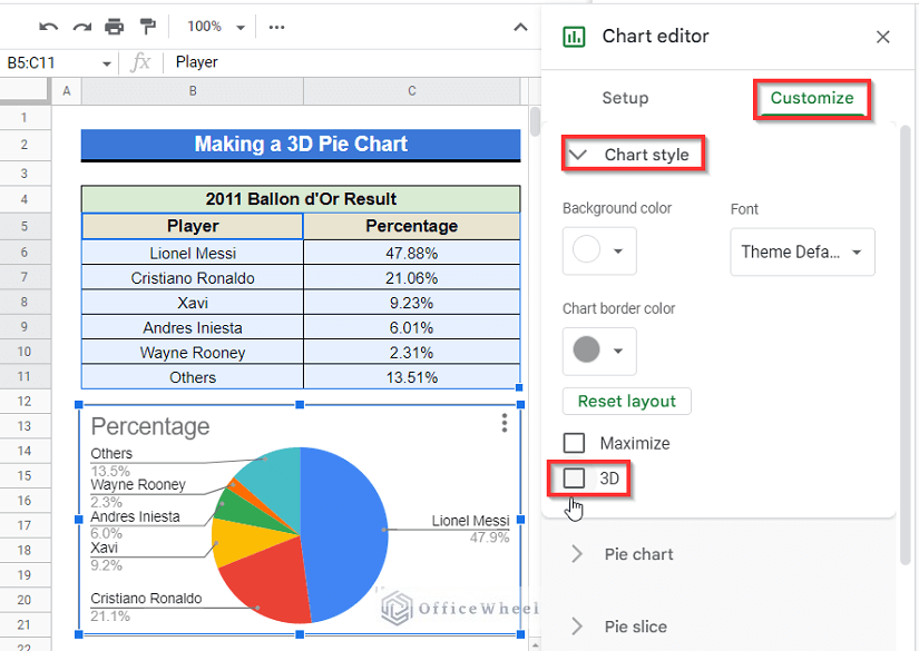
- After that, the 3D pie chart will be created.
How to Customize a 3D Pie Chart?
After creating the 3D pie chart, you can customize it at your convenience. Here, we’ll discuss some of them.
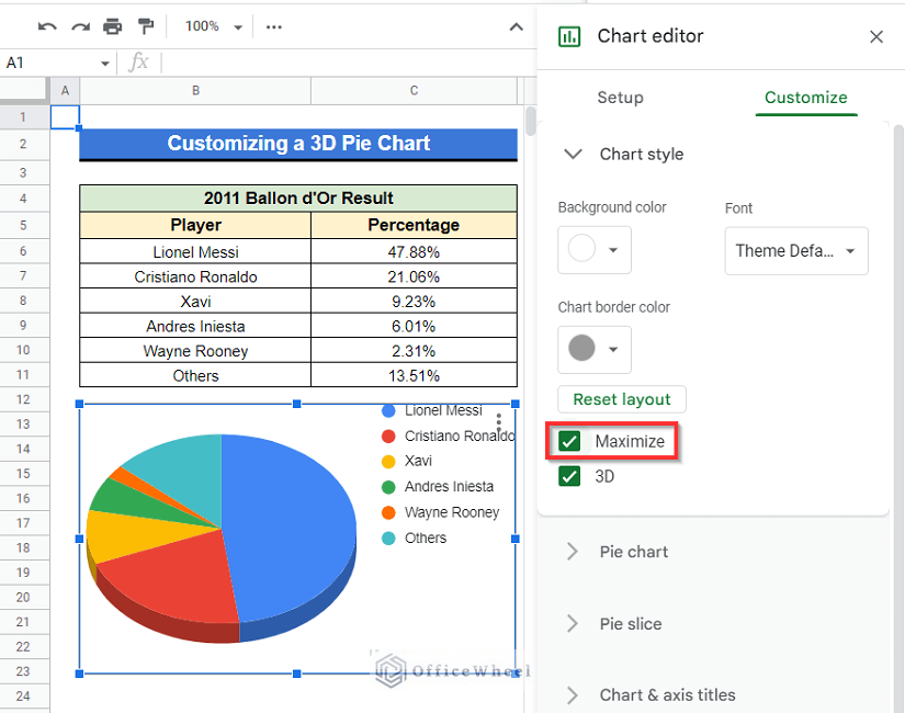
1. Maximize 3D Pie Chart
You can maximize the size of your 3D pie chart for better visuality.
Steps:
- At the “Chart editor” menu, select Customize then mark the Maximize option.
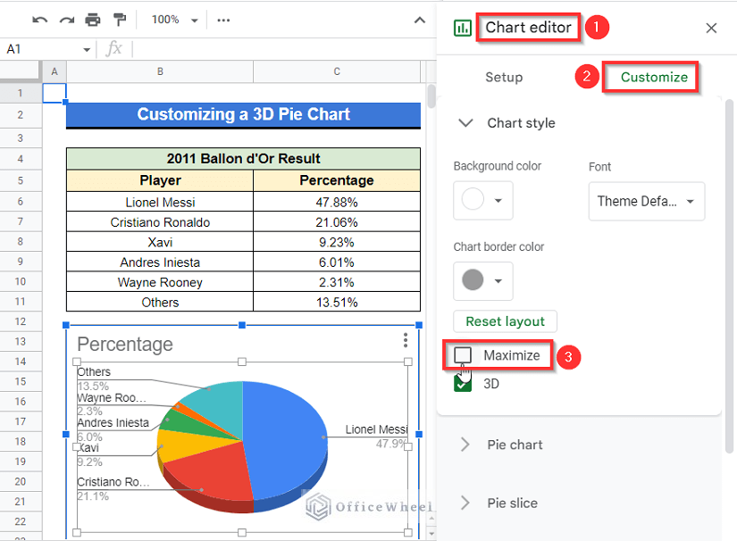
- After marking the Maximize box, the size of your 3D pie chart will be maximized.
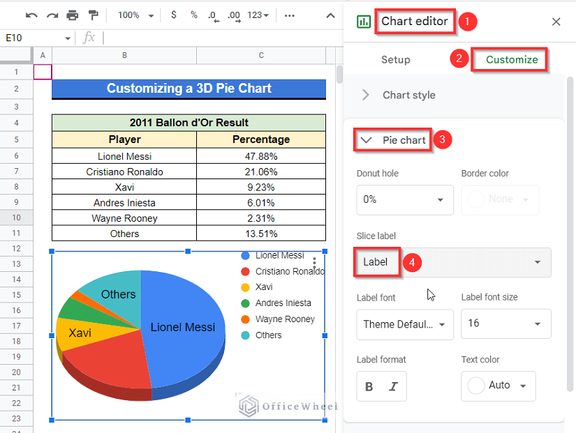
2. Add Slice Label
You can add labels on slices in your 3D pie chart.
Steps:
- Activate the “Chart editor” sidebar like previously. Then select Customize, go to the Pie chart drop-down then select Label from the Slice label
- Soon after, you will get the labels on the slices like the image below.
Read More: How to Label Pie Chart in Google Sheets (With Easy Steps)
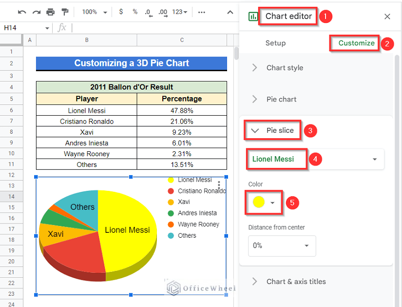
3. Edit Slice Color
You can modify the slices in your 3D pie chart as well. Like, suppose you want to change the color of the slice of Lionel Messi from Blue to Yellow.
Steps:
- Select Customize from the Chart editor, then go to the Pie slice drop-down, select Lionel Messi from the first Drop down, then select the color Yellow from the second Color Drop down option.
Read More: How to Change Pie Chart Colors in Google Sheets
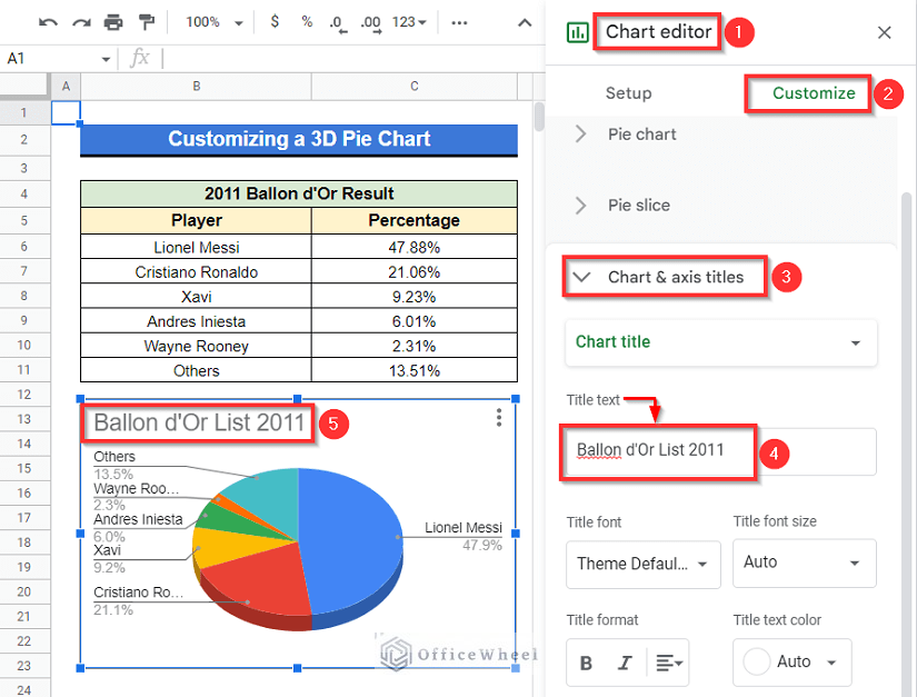
4. Change Chart Title
The title of the 3D pie chart you made can easily be changed. Suppose, you want to change the chart title from “Percentage” to “Ballon d’Or List 2011”.
Steps:
- Activate the Chart editor by simply left-clicking twice on your 3D pie chart. Select Customize and then select Chart & axis titles Drop-down Simply type “Ballon d’Or List 2011” in the Title text box and the title will be changed.
Read More: How to Change Title of Pie Chart on Google Sheets
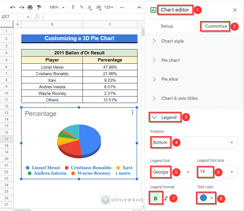
5. Modify Legend
You can modify the legend in your 3D pie chart as well. Let’s assume, you want to-
- Change the position of the legends to the bottom.
- Change the legend font type to Georgia.
- Change the legend font size to 14.
- Change the legend format to Bold &
- Change the text color of your legends to Dark Blue.
Steps:
- Activate the Chart editor by left-clicking twice on your chart. Select Customize.
- Then select the Legend Drop down Set the position of the legends to the Bottom from the “Position” Dropdown option.
- Change the legend font type to Georgia from the “Legend font” Drop down
- Set the font size to 14 from the “Legend font size” Drop down
- Set the legend format to Bold from the “Legend format” option.
- Change the legend text color to Dark Blue from the “Text color” option and then you are all done.
Conclusion
As mentioned before, charts, graphs or diagrams are important for better understanding and for better visualization. These are the most time-saving processes for going through particular stuff as a whole. Creating 3D pie charts in Google Sheets is simpler than you thought, right? The following article elaborated on all the steps and important customization procedures to make a 3D pie chart in Google Sheets. Hope this may help with your task. Visit our website officewheel.com for more relevant articles. Thank you.