Google Sheets offers a variety of visualization possibilities, the Pie Chart being one of them. Using this tool, you may display data and understand how various data components work together to form the total. In Google Sheets, making a pie chart is easy. A pie chart can be easily added from the Insert menu by selecting two columns. However, by default, this pie chart simply includes the legend and the graph title. Sometimes we need to change the title of a pie chart on Google Sheets. In this article, I’ll demonstrate a step-by-step procedure of how to change the title of a pie chart on Google Sheets. After that, I’ll also show how to customize the title of a pie chart in Google Sheets. Here is an overview of what we will archive:
Step-by-Step Process to Change Title of Pie Chart on Google Sheets
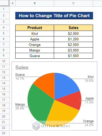
Let’s familiarize ourselves with our dataset first. The dataset includes a list of products and the sales for each product at a specific shop in 2022. Next, we’ll make a pie chart using this dataset and show you how to change the title of the pie chart on Google Sheets.
Step 1. Create a Pie Chart
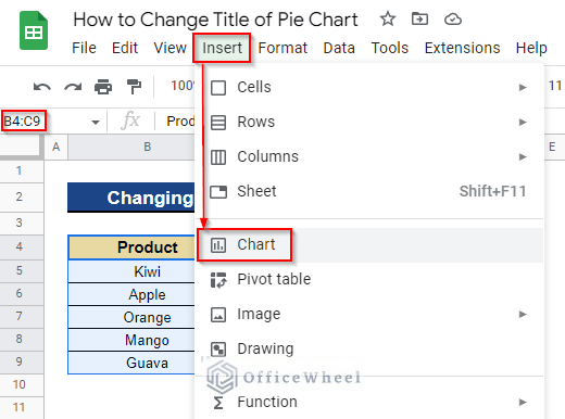
- Firstly, select the entire dataset to create a pie chart. We selected Cell B4:C9. Next, go to the Insert menu from the top menu bar and select Chart.
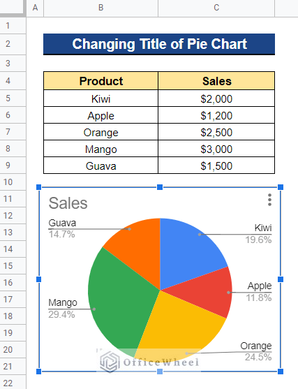
- As a result, it will automatically create a pie chart using the dataset.
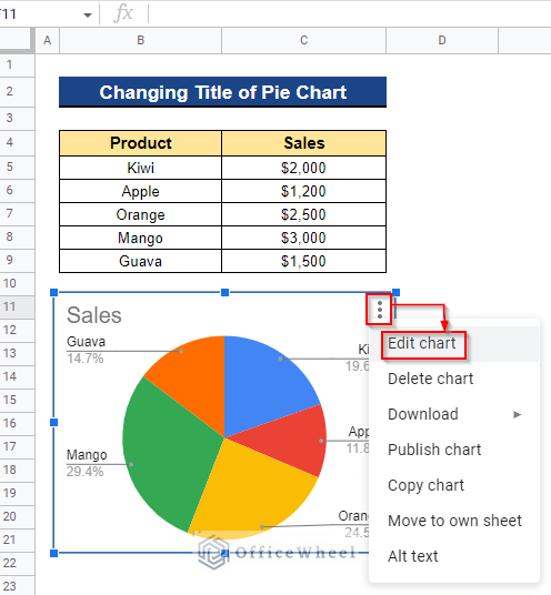
Step 2. Open Chart Editor
- Now select the chart by clicking on it once. Then, click on the Vertical Ellipsis (⋮) sign in the chart’s upper right corner, and finally click on the Edit Chart option.
Read More: How to Edit a Pie Chart in Google Sheets (5 Core Features)
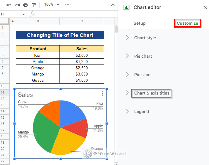
Step 3. Open Chart & Axis Titles Section
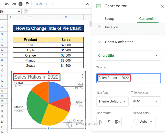
- It will open a dialog box called Chart Editor. Next, go to the Customize section and click on the Chart & axis titles option.
Read More: How to Copy a Pie Chart from Google Sheets (5 Easy Ways)
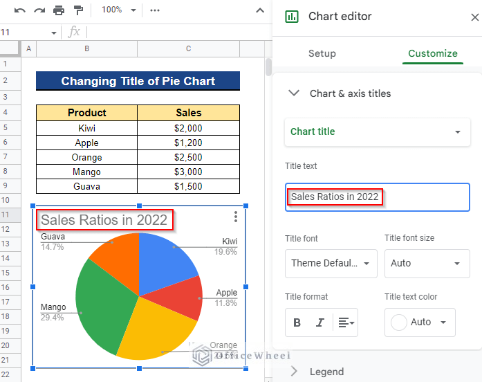
Step 4. Change Title Text
- Now insert the desired title in the Title text box. We wanted to change the title of the pie chart to Sales Ratios in 2022. The title text will change right away once you start typing.
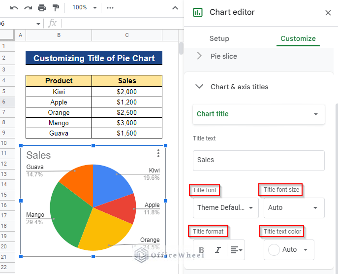
How to Customize Title of Pie Chart on Google Sheets
In addition to altering the pie chart’s title, you can also change the title’s font, size, format, and color. Let’s begin.
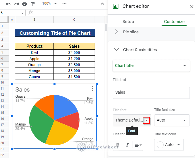
1. Switch Title Font
We might occasionally want to use a certain font for the pie chart’s title. We can do this by changing the title font.
Steps:
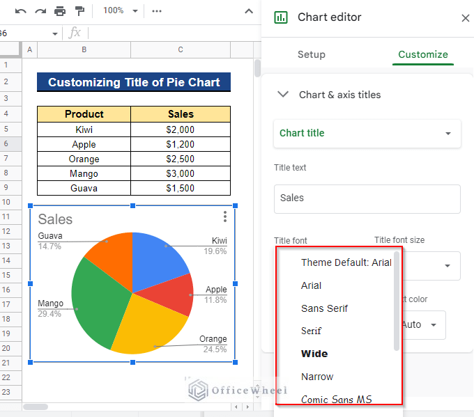
- Firstly, click on the drop-down icon in the Title font section.
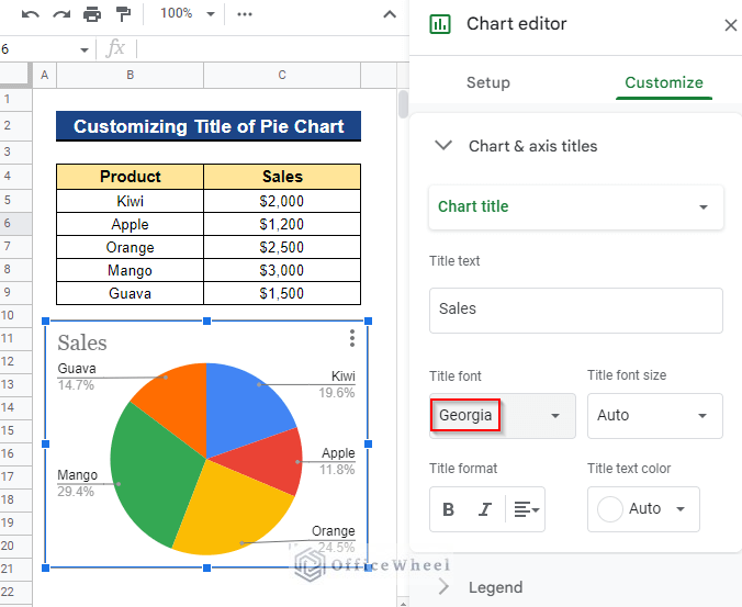
- It will appear a list of choices similar to the one below. Then, choose the font that you prefer. In our case, we chose the Georgia font.
- Thus, it will change the title font as you preferred.
2. Change Title Font Size
We may wish to change the font size of the title in order to visualize the pie chart clearly. We can obtain this using the Title font size section.
Steps:
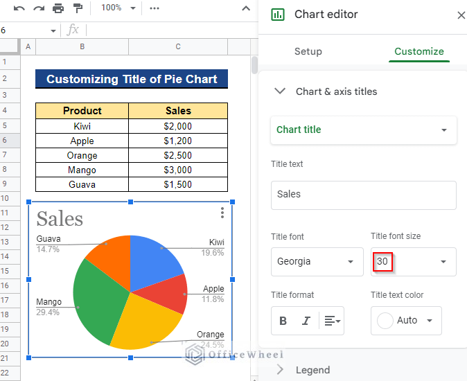
- First, select the drop-down icon on the Title font size section. Next, choose the font size you want to use to show the title.
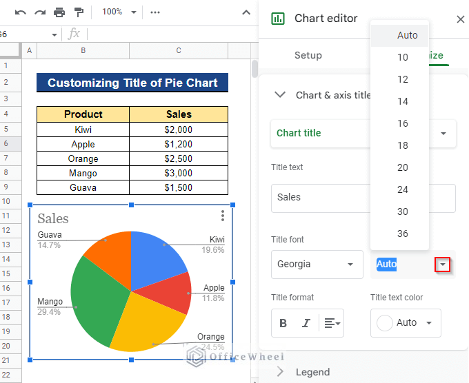
- In our case, we chose the font size 30 to display the title. As a result, you will receive your title in the specified font size.
3. Modify Title Format
You could also wish to alter the formatting of the titles to make them more apparent. Continue reading to find out how to modify the title formatting.
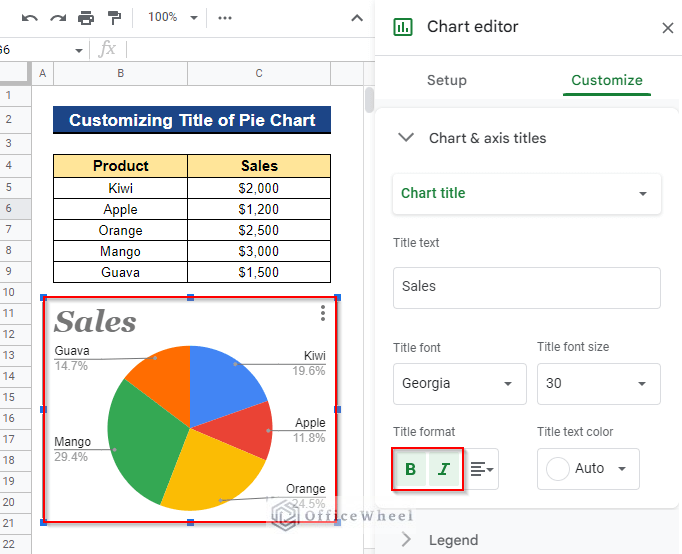
Steps:
- Click on the Bold or Italic format or both, based on your preference. In our case, we clicked on both formats. The formatted titles now appear as follows.
4. Edit Title Text Color
Sometimes we might wish to alter the text color of a pie chart’s title so that we can visualize the pie chart as we desire. We can easily accomplish this by changing the title text color in the Title text color section.
Steps:
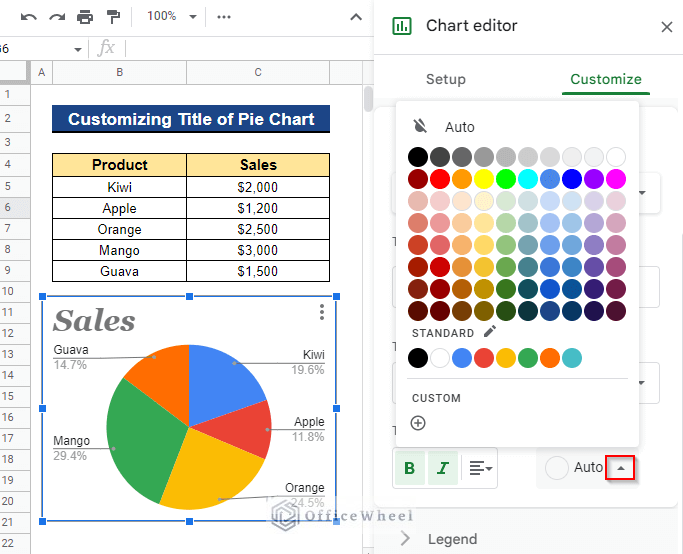
- In the Title text color section, first, select a color from the drop-down menu. You’ll see a variety of colors. Now choose your preferred color.
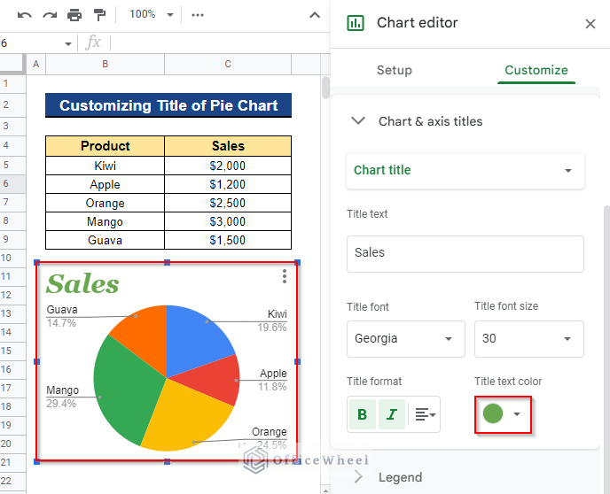
- In our case, we selected the color green for our title text. In our pie chart, the title now appears as follows.
Read More: How to Change Pie Chart Colors in Google Sheets
Conclusion
This brings to an end our tutorial on how to change a pie chart’s title on Google Sheets. I hope this will make it easier for you to change the title to what you like. In the comment box below, feel free to make any suggestions or ask any questions. Visit our website Officewheel.com to read more fascinating articles on Google Sheets.