Bar graphs are commonly used to display data in a visual format. Sometimes the default colors of a bar graph may not be the best fit for your data or presentation. In this article, we will explore different methods of how to change the color of a bar graph in Google Sheets.
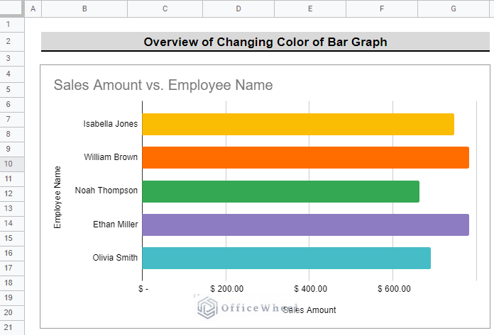
The above screenshot is an overview of the article, representing how we can change the color of the bar graph in Google Sheets.
A Sample of Practice Spreadsheet
You can download the spreadsheet and practice the techniques by working on it.
Step-by-Step Process to Change Color of Bar Graph in Google Sheets
Step 1: Setting Up Dataset and Corresponding Bar Graph
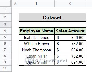
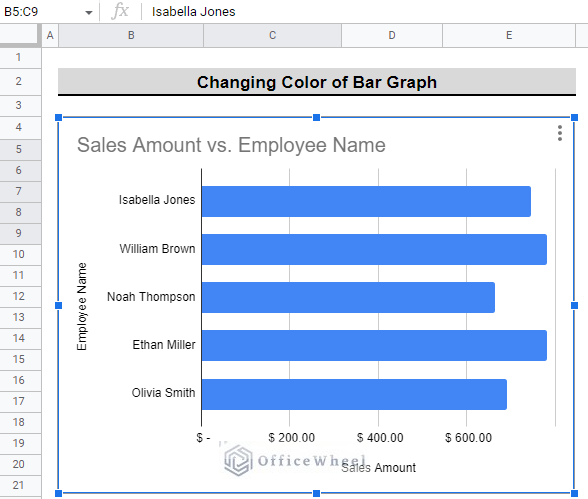
We have the following dataset with Employee Names and the Sales Amount of each employee. We use this table to create a bar graph in Google Sheets and change the color of that bar graph.
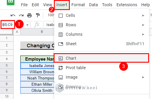
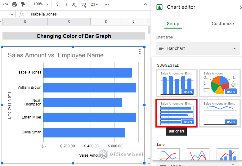
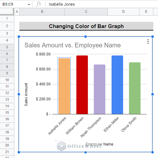
- First, select the data range and go to Menu bar > Insert > Chart. We select range B5:C9 in our example.
- Then, you will see that the default graph appears.
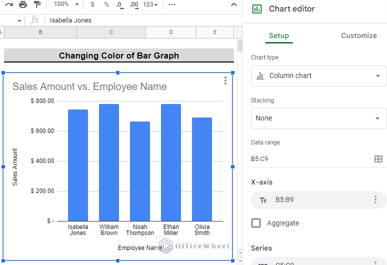
- If the default is not a bar graph, to change this to a bar graph, go to the side panel of the chart and select Bar chart from the Chart type drop-down menu.
- Your bar chart is now ready. You can change the default color easily.
Read More: How to Apply Color to Drop Down List in Google Sheets (2 Ways)
Step 2: Customizing the Color of Data Points of Bar Graph
The color of data points of a bar graph can be customized according to your liking in 2 different methods. We have discussed all the methods in this section.
1. From the Customize Menu
You can change the color of all the bars at once or can change the color of a particular bar from the Customize menu.
I. Changing Colors of All Bars
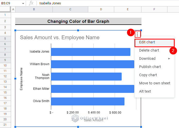
- First, select the bar graph and in the upper right corner you will see a vertical three-dot option. Click on that and click on Edit chart to summon the Chart editor
- Or, you can summon the chart editor by double-clicking anywhere on the chart.
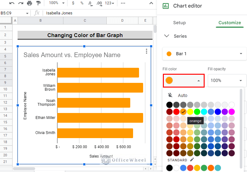
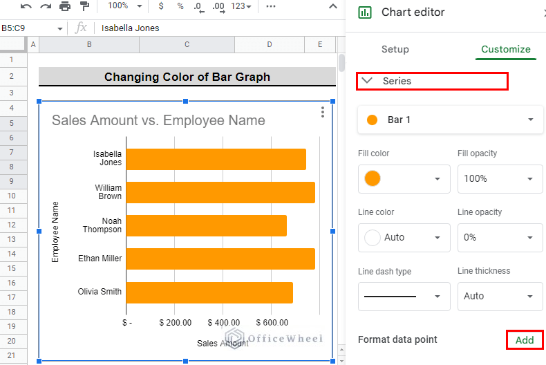
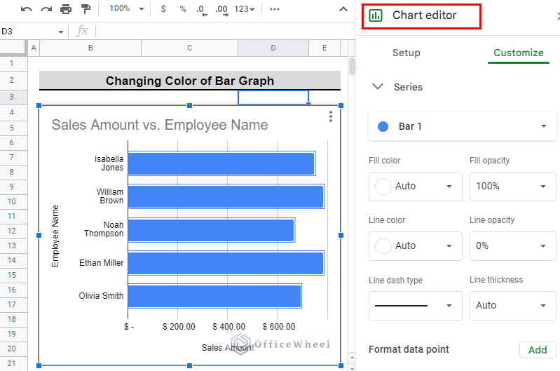
- After that, in the Chart editor menu go to Customize > Series.
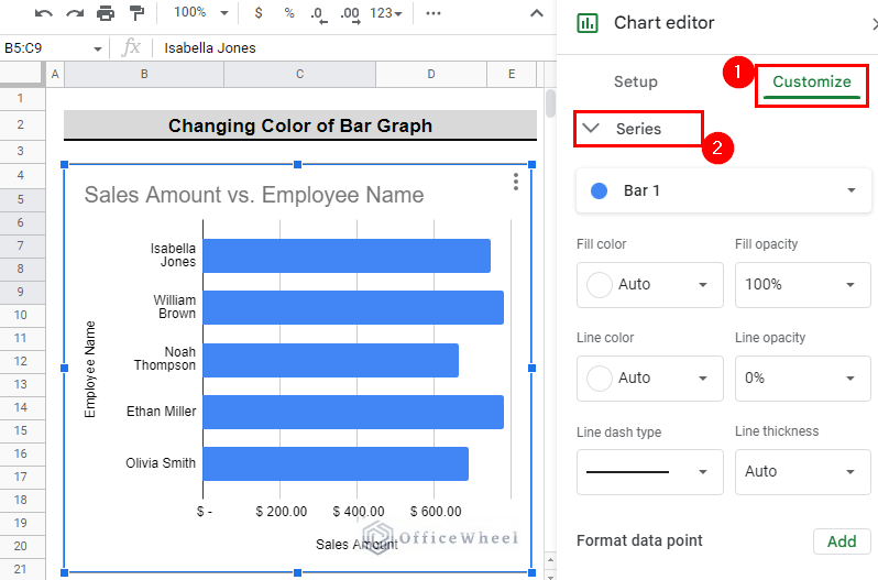
- Secondly, to change the fill color of all the bars, select the Fill color which is set to Auto and select the color that you want. We select Orange for our example.
II. Changing Colors of Individual Bars (Data Points)
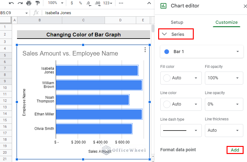
- Now, if you want to change the color of each bar individually, select Add in the Format data point in the Series section under Customize
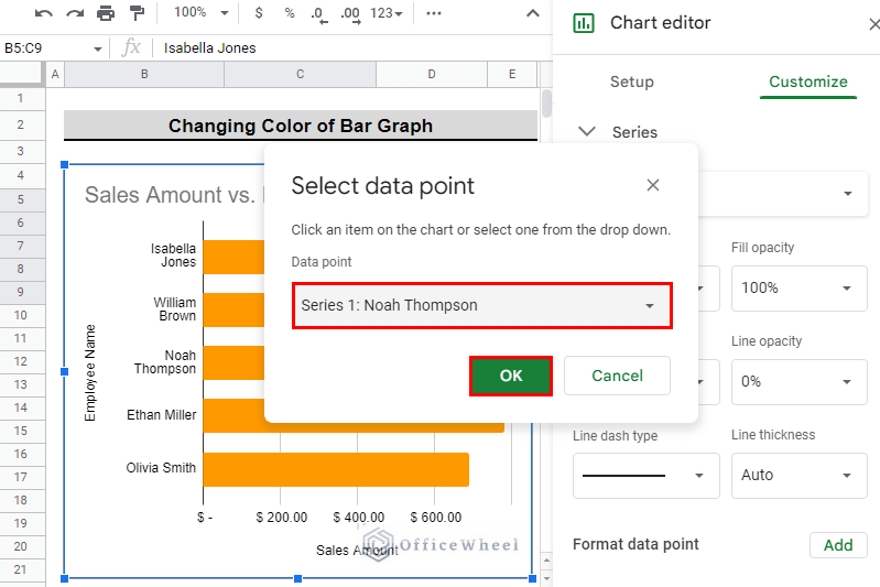
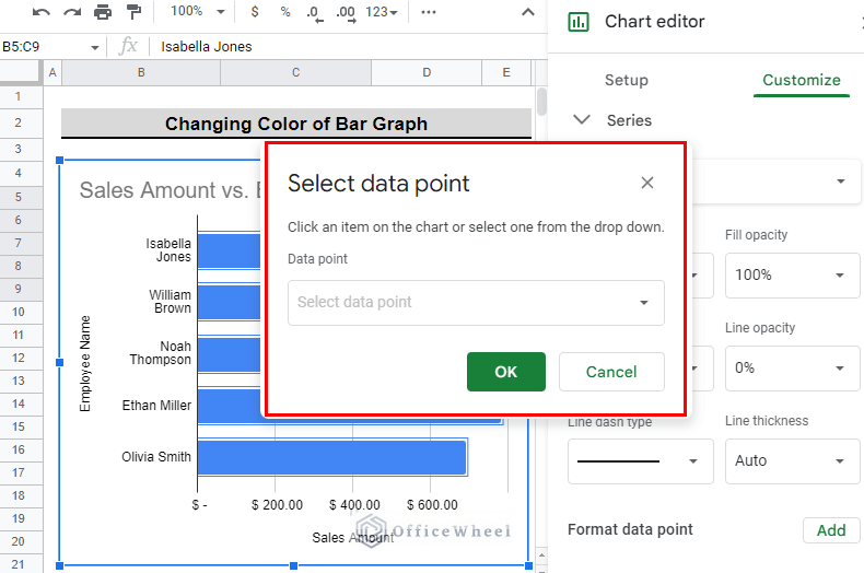
- After that, you will see a popup appear that will allow you to select a data point whose color you want to change.
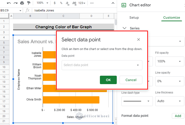
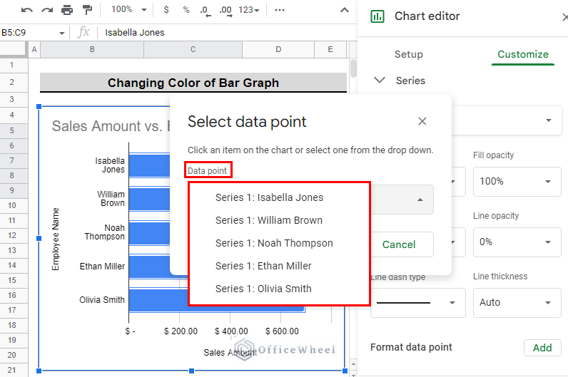
- Then, click on Select data point under the Data point section and you will see all the data point options.
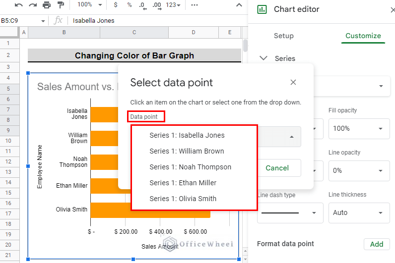
- Afterward, select the data point whose color you want to change. We select Series 1: Noah Thompson for our example. And press OK.
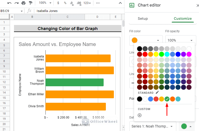
- After that, you will see a popup appear with colors in it. Select the color you want for this particular name. We select the standard Green color.
- You can continue to click on Add in the Format data point in the Series menu to select a color for each name or bar. We select Add to change the color of the bar named Isabella Jones.
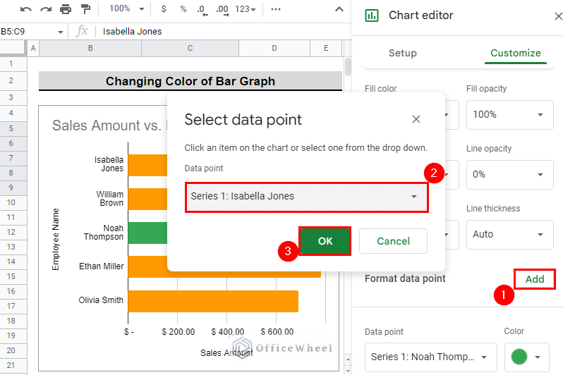
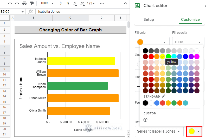
- Then, select the color for the name you selected. We selected the color Yellow for Isabella Jones.
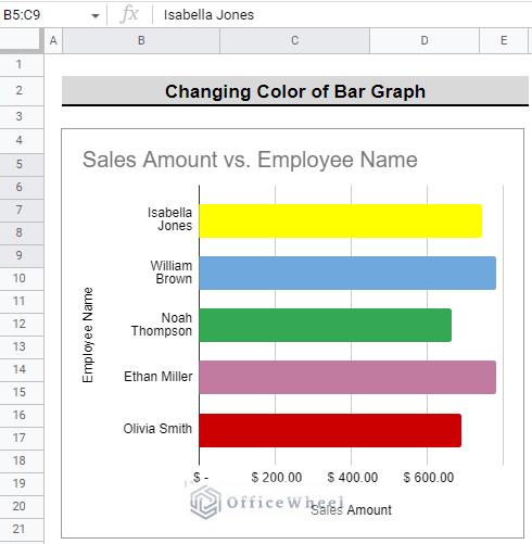
- This is how our final graph looks after changing the colors of all the bars individually.
2. Directly From the Graph
This approach only lets you change the colors of individual bars or data points of the bar graph. This can be achieved in two ways.
I. Data Point Option
- First, select the individual bar from the graph by double-clicking on the bar. We selected the bar named Olivia Smith. You will see a side panel appear.
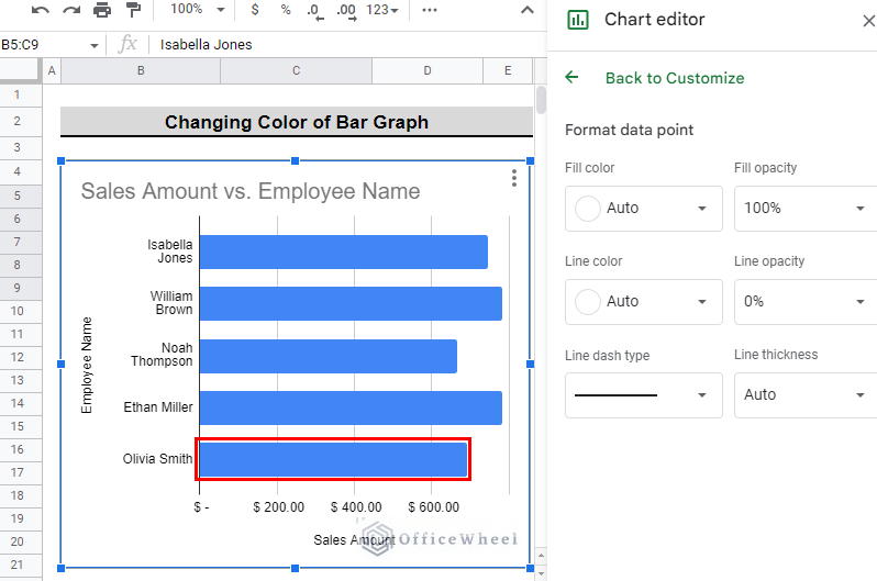
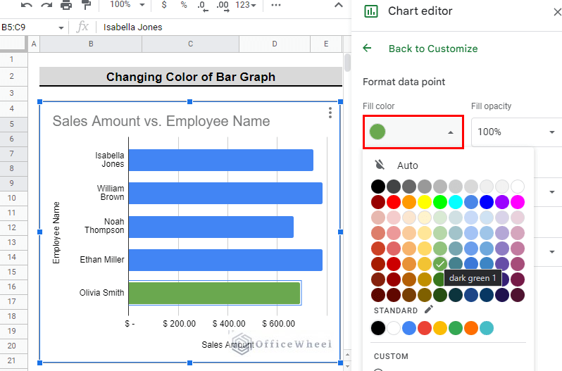
- Then, on the Format data point section, select Fill color and select the color you want for that particular bar. We select dark green 1 for this particular bar.
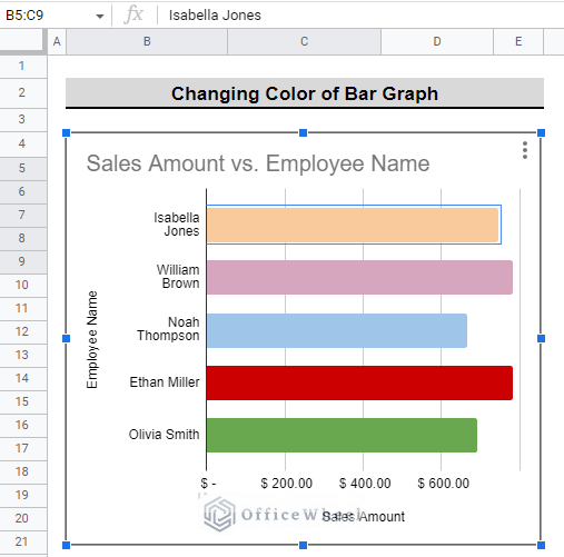
- Finally, you can change the color of each bar in this method. This is how the bar graph looks after changing the color of each bar in this method.
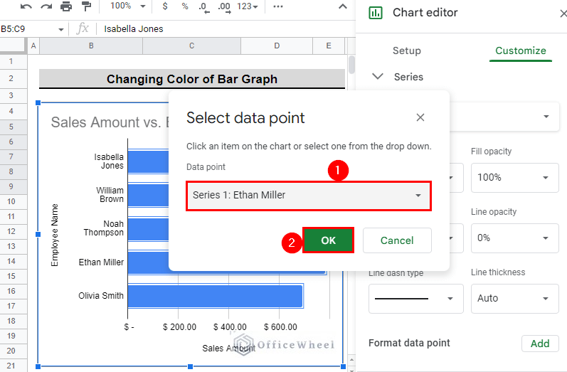
II. Series Option
- First, double-click on the bars from the graph. This will summon the chart editor panel.
- Now, select Add in the Format data point in the Series section under Customize menu.
- After that, you will see a popup appear that will allow you to select a data point whose color you want to change.
- Then, click on Select data point under the Data point section and you will see all the data point options.
- Afterward, select the data point whose color you want to change. We select Series 1: Ethan Miller for our example. And press OK.
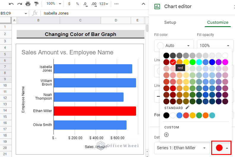
- After that, you will see a popup appear with colors in it. Select the color you want for this particular name. We select the red color.
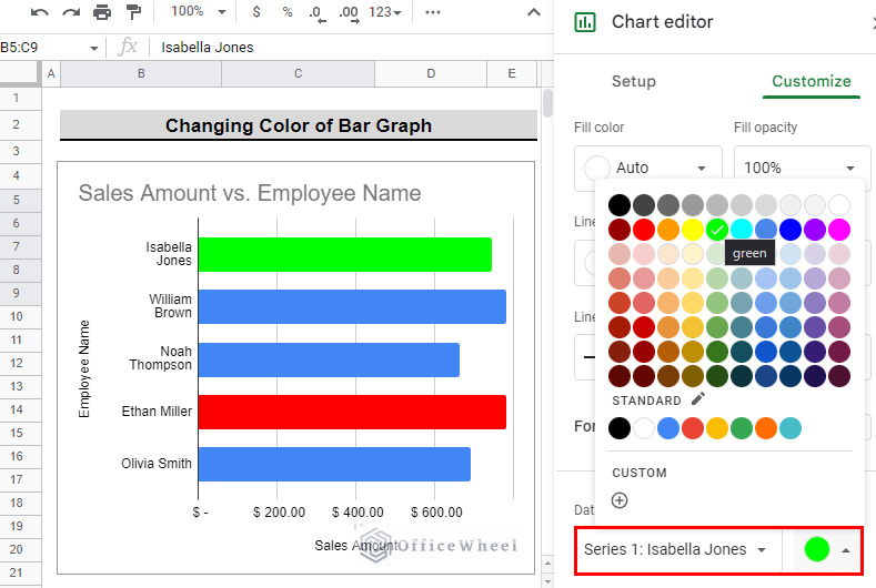
- You can continue to click on Add in the Format data point in the Series menu to select color for each name or bar. We select Add to change the color of the bar named Isabella Jones to green.
Step 3: Finalizing the Results
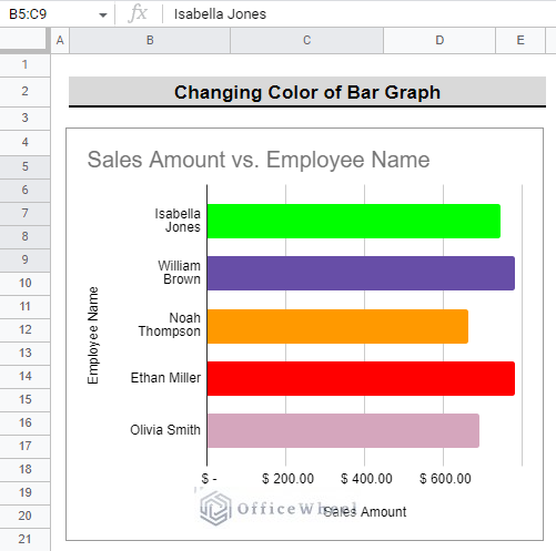
This is how the final dataset looks after changing the color of the bar graph.
Similarly, you can also change the color of the Column graph by following the steps described above.
Conclusion
This article explains the steps to change the color of a bar graph in Google Sheets. It is recommended to try out the steps in order to have a better understanding. The intention of this article is to offer useful information and assist you in achieving your goal.
Additionally, consider looking into other articles available on OfficeWheel to expand your understanding and skill in using Google Sheets.