Different charts can summarize and represent data in different ways. Using the aggregate chart option in Google Sheets we can create those useful summary charts without explicitly performing necessary mathematical calculations on our dataset. The only thing we need to do is choose the proper group of columns and select the type of aggregation. This article serves as a step-by-step guide to creating an aggregate chart in Google Sheets.
A Sample of Practice Spreadsheet
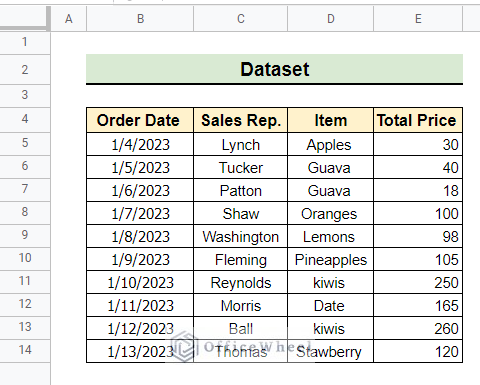
You can download the spreadsheets from the link below. The spreadsheets contain a dataset we use here.
Step by Step Procedures to Create Aggregate Chart in Google Sheets
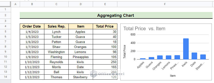
Aggregating charts in Google Sheets is quite simple. In this tutorial, we show the aggregation of different fruit items and their selling price using the following dataset.
Step 1: Selecting Columns
We can easily select columns in Google Sheets. Selecting columns is essential for inserting the desired chart in Google Sheets.
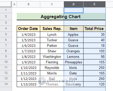
- At the very beginning, we need to select the columns that will be used in the aggregated chart.
- In this demonstration, we select column D and column E to create a regular chart in the first stage.
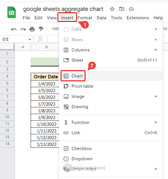
Step 2: Inserting Chart
Inserting chart is one of the basic steps of aggregating charts in Google Sheets. Now we want to insert a chart using the selected columns.
- To insert a chart, we select Insert from the menu bar.
- Then, we click on Chart.
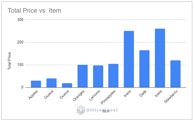
- As a result, we will get the following chart inserted in the current sheet with a Chart editor window at the top right corner of the main window. However, this chart is not aggregated as the same fruit item appears multiple times in the chart.
Read More: How to Use Aggregation Functions in Google Sheets (5 Examples)
Step 3: Aggregating Chart
This step is at the heart of aggregating charts in Google Sheets. We can simply perform this step by following the below instructions.
- Initially, we check the Aggregate box from the Chart editor window.
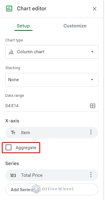
- As a result, Sum is selected as Aggregate Type by default.
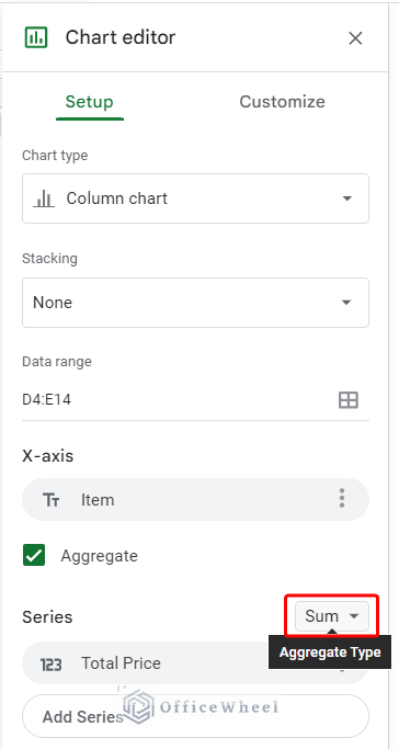
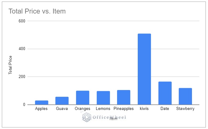
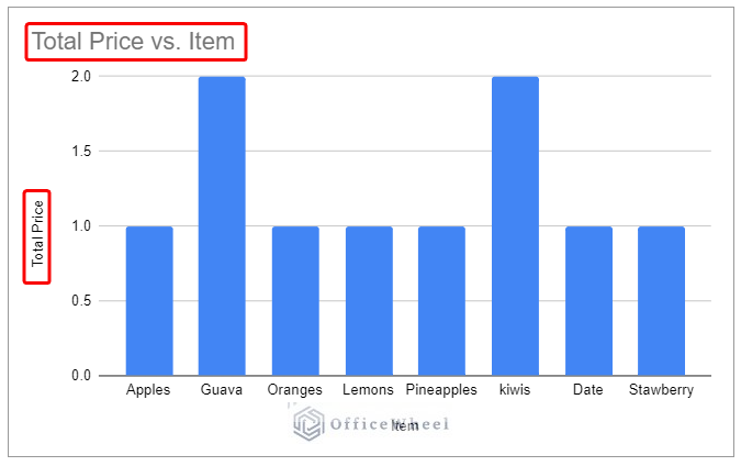
- Consequently, the insert chart has been altered, and no fruit item appears multiple times.
Read More: Pivot Table Chart Aggregation in Google Sheets (With Easy Steps)
Step 4: Selecting Other Aggregate Types
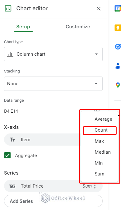
Sum is not the only Aggregate Type available in Google Sheets. We can easily change the Aggregate Type from the Chart editor window. From the Chart editor window, we can change the Aggregate Type by clicking on the option as indicated.
I. Aggregate Type: Count
Now we want to see how to set Count as the Aggregate Type for our inserted chart.
- Firstly we select the Aggregate Type box as earlier and then we select Count as indicated.
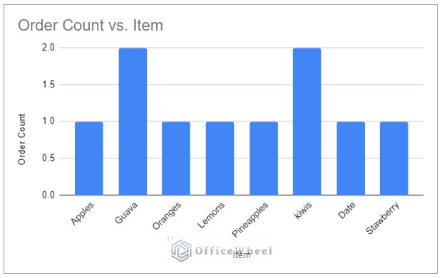
- As a result, we will get the following chart where counts of order number for each item appear in the vertical axis of the chart. We make meaningful changes to the Chart title and Vertical axis title by double-clicking on both of them as indicated in the figure below.
- Finally, we get the Aggregated chart of Order Count vs. Item as follows.
II. Aggregate Type: Average
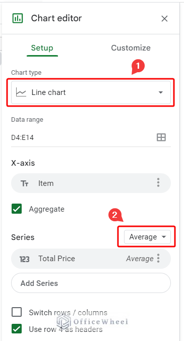
This time we want to get a line-type chart and use Average as the Aggregate Type in our inserted chart.
- First of all, we select Chart type option as Line chart.
- Then, we select Average as the Aggregate Type.
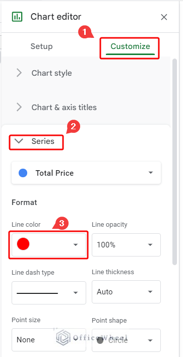
- Afterward, we select Customize from the Chart editor window.
- Next, we click on Series and pick red as Line color.
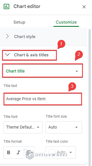
- Now, we click on Chart & axis titles and select Chart title.
- Then, we write down Average Price vs Item in the Title text box.
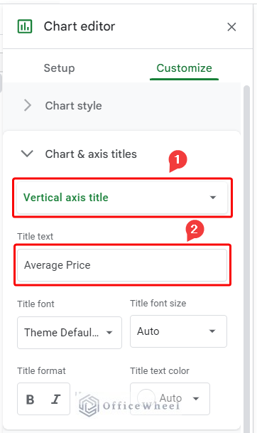
- Later, we select Vertical axis title from Chart & axis titles group.
- Then, we write down Average Price in the Title text box.
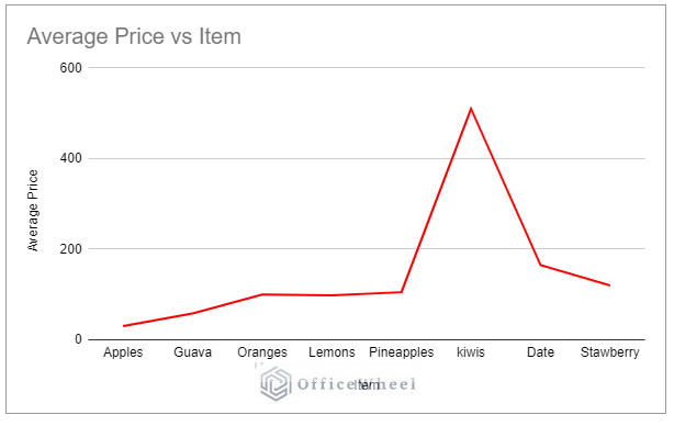
- By this time, our inserted chart changes and takes the following shape. This is the Aggregated chart of Average Price vs Item.
III. Aggregate Type: Min
We can visualize the minimum price of each fruit item of our dataset by simply selecting Min as the Aggregate Type of the inserted chart.
- Here, we select Min as the type of aggregation similar to the following.
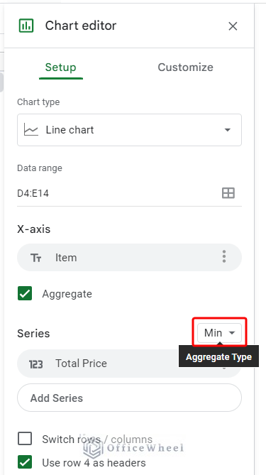
- Then, similarly, we make the necessary changes to the title of the chart from the Title text option of the Customize tab.
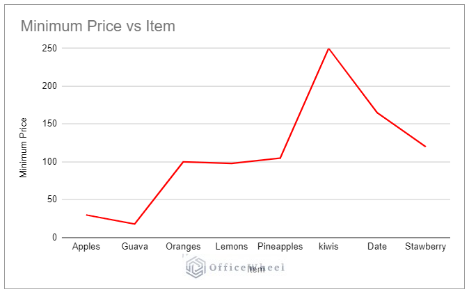
- As a result, we get the Aggregated chart of Minimum price vs Item as follows.
IV. Aggregate Type: Max
This time we want to see how our chart looks like when we select Max as the Aggregate type.
- As usual, we select Max as the type of aggregation for this time like the following.
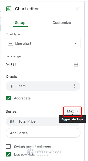
- Then, we make the necessary changes to the title of the chart from the Title text option of the Customize tab as earlier.
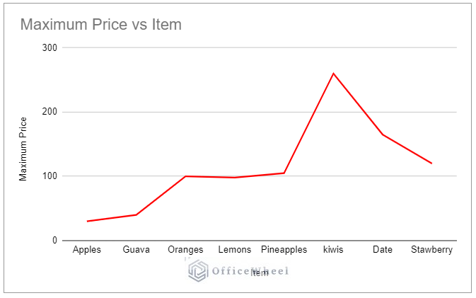
- As a result, we get the aggregated chart of Maximum Price vs Item as follows.
V. Aggregate Type: Median
Median is another important parameter that needs to be visualized when analyzing data. We can easily visualize the median values of our dataset by setting Median as the Aggregate Type.
- Firstly, we select Median as the type of aggregation like the following.
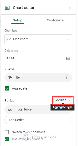
- Next, we make the necessary changes to the title of the chart from the Title text option, which is in the Customize tab.
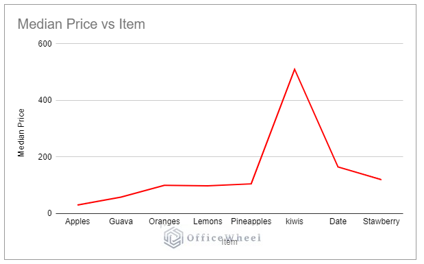
- Consequently, we get the aggregated chart of Median Price vs Item as follows.
Things to Remember
- Try to use the aggregate chart option for quick visualization before in-depth analysis of data.
- Always remember you can’t aggregate string data using the Aggregate option in Google Sheets.
Conclusion
Google Sheets Aggregate chart is handy for quick visualization of data. I believe from now on you can take full advantage of it t. Further, If you have any questions regarding this article feel free to comment below and I will try to reach out to you soon. Visit our website OfficeWheel for many more useful articles.