Pivot Table is a multi-functional tool in Google Sheets. Its usage includes summarizing, analyzing, visualizing data, and so on. In this article, we are going to discuss pivot table chart aggregation in Google Sheets. These types of charts are integrated with the Pivot Table. This integration offers some major advantages over ordinary charts such as dynamic changing of pivot parameters and filtering etc.
Step-by-Step Procedure for Pivot Table Chart Aggregation in Google Sheets
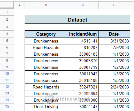
The dataset contains the date of the crime incidents and the category of the incidents with an incident number in three different columns. We want to visualize the dataset using pivot table charts.
Step 1: Prepare Dataset
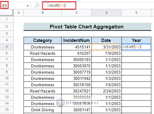
- First of all, we have to prepare and change the dataset to our needs. So, we create an additional column named “Year”.
=YEAR(D5)- Then, we select cell E5 and extract the year of the incident from the given date using the above formula.
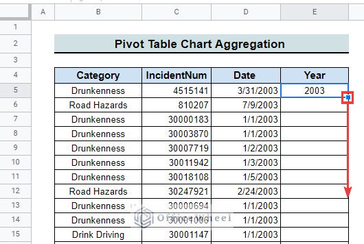
- Finally, dragging down the fill handle we extract the year for all the incidents.
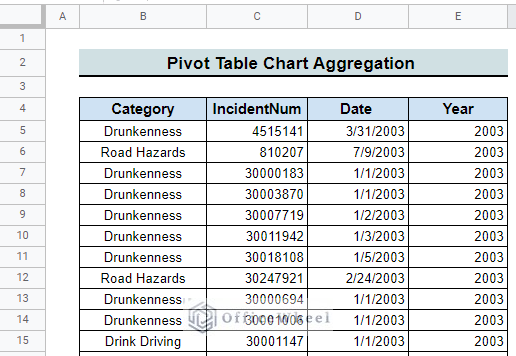
- Once we complete the fill handle operation we will get the following prepared dataset for the pivot table chart aggregation.

Read More: How to Create Aggregate Chart in Google Sheets (with Easy Steps)
Step 2: Insert Pivot Table
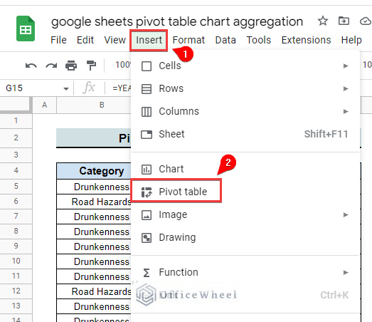
- In this step, we have to insert the Pivot Table. For that, we select Insert from the menu bar.
- Then, we select the Pivot table as indicated.
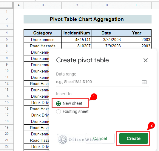
- After selecting the Pivot table a window opens with available choices for inserting the Pivot table. We insert the Pivot table in a new sheet and then select Create.
- Finally, a pivot table is created as follows.

Step 3: Add Rows and Columns
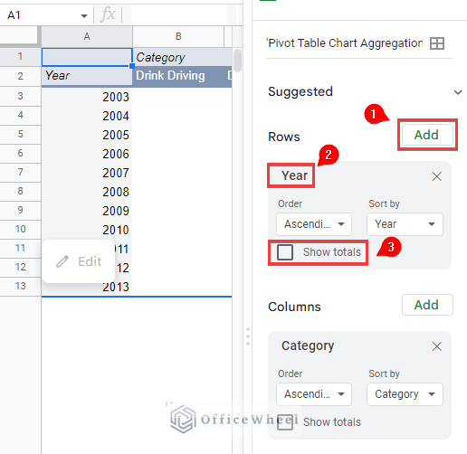
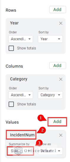
- Adding rows and columns is the most important step of pivot table chart aggregation. In this step initially, we select Add for adding rows. Then we select Year as the row of our pivot table chart.
- After that, we unchecked the Show totals box.
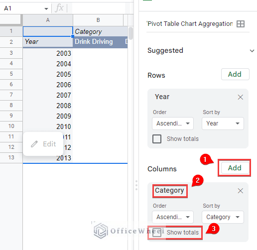
- For adding columns we select Add as earlier. Then we select Category as the column of our pivot table chart.
- At last, we unchecked the Show totals box as earlier.
Step 4: Choose Values
- Another step of pivot table chart aggregation is adding chart values. We select Add as earlier to add values.
- Next, we select IncidentNum as the value of the chart.
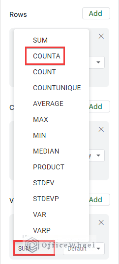
- Then we select the ‘Summarize by’ box where SUM is selected by default.
- Afterward, we change the default value SUM by COUNTA as follows.
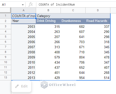
- Finally, we got the following pivot table.
Step 5: Insert Pivot Table Chart
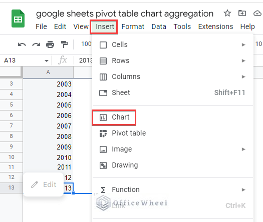
- The last step of our pivot table chart aggregation is inserting the pivot table chart. Here, we select Insert from the menu bar and then Chart as shown.
- Once we select Chart we are at the finishing line of the pivot table chart aggregation in Google Sheets. And got the expected pivot table chart as follows.
Things to Remember
- Try to prepare your data properly before inserting the pivot table.
- Be careful about the range of data when inserting the pivot table.
Conclusion
Following this article, I believe you can apply Pivot Table Chart aggregation in Google Sheets. Furthermore, If you have any queries about the steps we follow in this tutorial feel free to comment below and I will try to reach out to you soon. Visit our website OfficeWheel for more useful articles.