Graphs and charts are excellent visualization tools that provide you with a high-level overview of your data and enable you to draw conclusions. One such method for visualizing changes in a variable’s value over time is a Candlestick Chart. You can make a Candlestick Chart conveniently in Google Sheets if you have properly organized data. So, in this article, we’ll see a step-by-step guide to make Candlestick Chart in Google Sheets with clear steps and images. We’ll also see customizing Candlestick Chart in Google Sheets. At last, you’ll get an output like the following image.
A Sample of Practice Spreadsheet
You can download Google Sheets from here and practice very quickly.
What Is Candlestick Chart in Google Sheets?
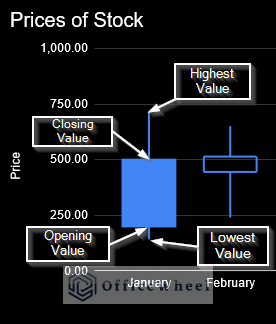
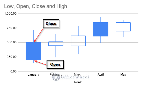
A Candlestick Chart makes it easier to see the opening and closing values as well as the overall variation in the value. It also depicts the highest and lowest values as you can see in the picture.
The meaning of these values is given below:
- Opening Value: The value at which a security initially trades at the start of a trading time like a day or month on a stock exchange is known as the opening value. You’ll find it at the bottom of the Candlestick Chart’s box.
- Closing Value: Similarly, the final transaction price of a security before the market formally shuts for regular trading is known as the closing value. You’ll see it at the top of the Candlestick Chart’s box.
- Lowest Value: It is the lowest stock price of a security over a certain period. It is situated at the bottom of the Candlestick Chart.
- Highest Value: It depicts the highest stock price of a security over a certain time. You generally found it at the top of the Candlestick Chart.
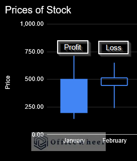
The OHLC (Open, High, Low, Close) data of stock securities can be shown on a Candlestick Chart by quickly summarizing all four pieces of information. When there is a profit (the opening value is less than the closing value), Google Sheets displays the Candlestick Chart with a filled box. When there is a loss (the opening value is more than the closing value), it displays the Candlestick Chart with a hollow box.
An excellent way to comprehend stock price variance on a specific day, week, month, or over any period of time is through this form of representation. As a result, we use it frequently to analyze stock price behavior. We can also use it to monitor scientific variables like temperature and rainfall.
Step-by-Step Guide to Make Candlestick Chart in Google Sheets
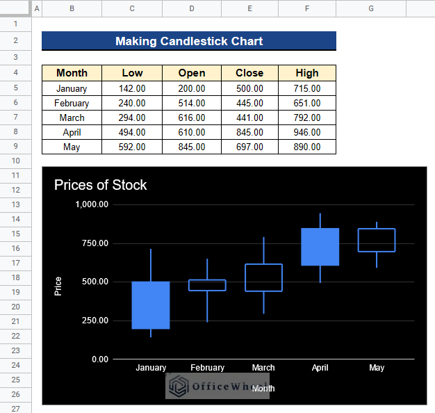
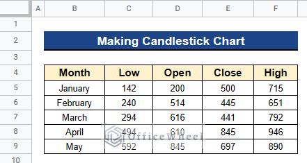
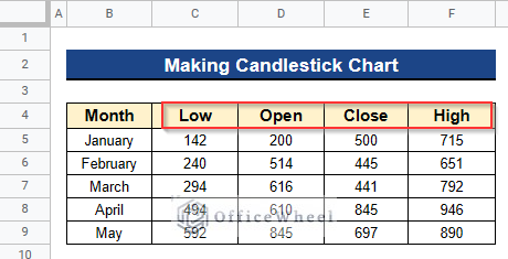
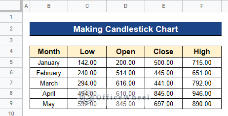
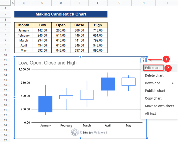
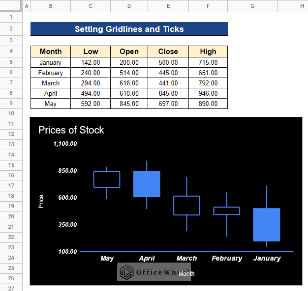
Let’s get introduced to our dataset first. Here we have Low, Open, Close, and High data values of stock prices over 5 months from January to May. The months are in Column B and the stock prices, Low, Open, Close, and High are in Columns C, D, E, and F respectively. Now, I’ll show you a step-by-step guide to make Candlestick Chart in Google Sheets by using this dataset.
Step 1. Making a Dataset
As long as your data is organized and formatted in the proper sequence, Google Sheets makes it incredibly simple and quick to construct a Candlestick Chart. So, preparing your dataset is the first and most crucial stage. You must enter your data in the following order Low-Open-Close-High in Google Sheets so that it recognizes the data values automatically. Below are the steps for making a dataset:
- Firstly, arrange your data values in the following order: Low-Open-Close-High.
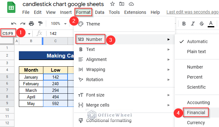
Step 2. Setting Financial Format
Then, we have to make the format of the stock prices Financial.
- So, select all the cells from Cell C5 to F9 and go to Format > Number > Financial.
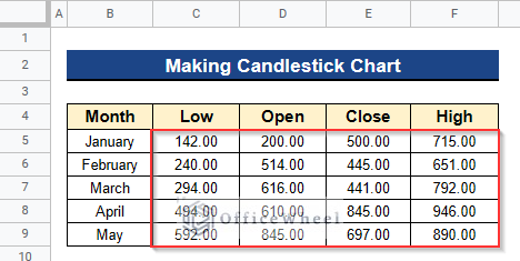
- Next, you’ll see all the stock prices are now in Financial format.
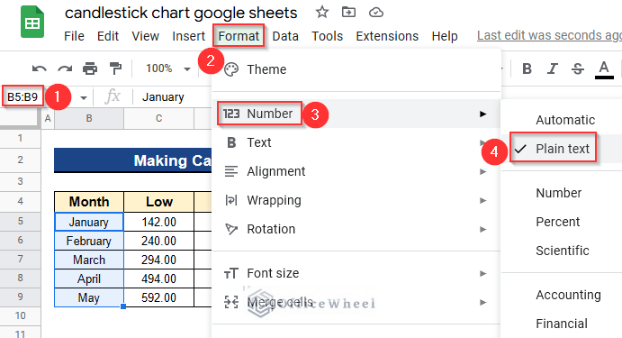
- After that, we have to make the month’s name in Plain Text format.
- So, select all the month’s names from Cell B5 to B9 and go to Format > Number > Plain Text.
- Finally, your dataset is now ready to insert a Candlestick Chart.
Step 3. Opening Chart Editor
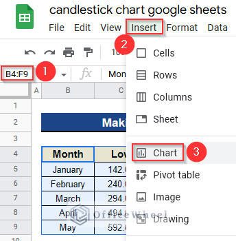
- At first, select all the values of the dataset from Cell B4 to F9 and go to Insert > Chart.
- Then, the Chart Editor window will open.
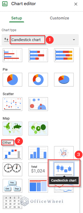
- Next, scroll down to go to the Other option under the Chart Type menu to find the Candlestick Chart.
- After that, select Candlestick Chart from the Chart Type menu to insert the Candlestick Chart in your Google Sheets.
Step 4. Inserting a Candlestick Chart
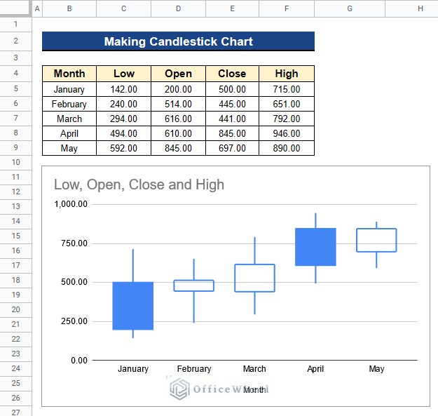
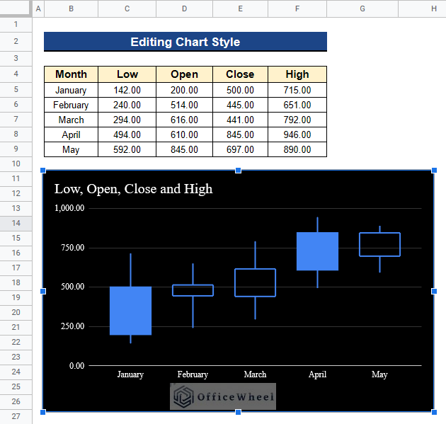
- After selecting Candlestick Chart from the Chart Type menu, you’ll see a Candlestick Chart is ready in your Google Sheets with the stock values of your dataset.
- The chart is created automatically with the existing stock data.
- You can see that it has the title “Low, Open, Close and High” which it takes from the column header.
- The horizontal axis is named as Month automatically.
Step 5. Understanding the Candlestick Chart
Now, we’ll understand the Candlestick Chart below:
- Each period of time has its own Candlestick in the Candlestick Chart. Each month’s price changes are represented by a single Candlestick in our example.
- It is representing the price range between the open and close of the month’s trading.
- The Candlestick’s top and bottom indicate the closing and opening prices, respectively as you can see in the picture.
- If the Candlestick is blue and filled, it indicates that the closing price was less than the opening price, and if it is hollow, it indicates that the closing price was more than the beginning price.
- A filled Candlestick is typically depicted in green, whereas a hollow Candlestick is shown in red. However, as of right now, Google Sheets does not allow changing the color of the Candlesticks.
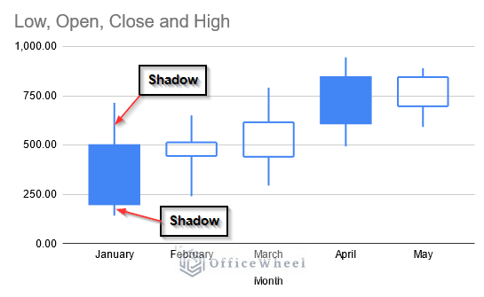
- The shadows of the Candlestick are immediately above and below the actual Candlestick’s body.
- The shadow at the bottom displays the lowest price for the entire time period, while the shadow at the top displays the highest price.
- A short upper shadow indicates that there was little price change during the trading period, while a larger upper shadow indicates that the price change was higher.
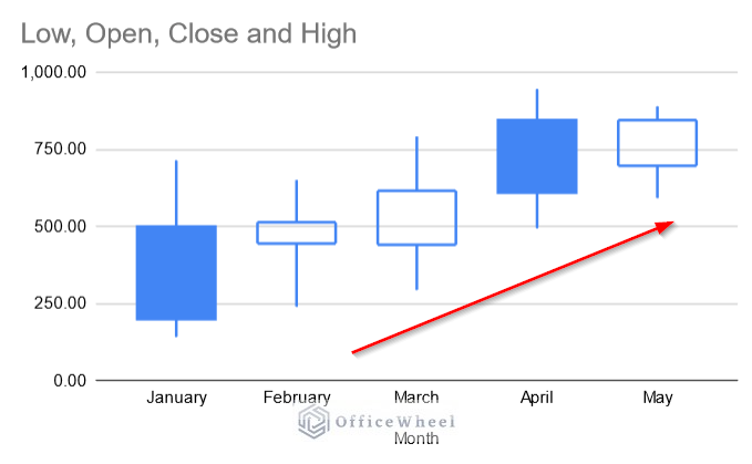
- When you observe a streak of filled Candlesticks rising, it indicates that stock prices are on the rise.
- Similar to this, a downward trend in pricing is indicated by a series of hollow Candlesticks moving in a downward sequence.
- As a result, you may forecast future stock values using the Candlestick patterns and begin looking for trading chances.
How to Customize Candlestick Chart in Google Sheets
There are several other adjustments you may make to your chart in Google Sheets, despite the fact that you cannot modify the color of the Candlesticks. You can edit your Candlestick Chart, change the titles to make it understandable, edit the range of your chart’s axis, change the format, and set gridlines and ticks in the chart. Below we’ll see the steps of doing these tasks one by one.
1. Editing Chart Style
You can not change the color of your Candlestick Chart. But you can modify its background color and fonts very easily. Now, we’ll change the background color to Black to make the chart more visible.
Steps:
- First of all, click on the 3 Dots on the Candlestick Chart and select Edit Chart to open the Chart Editor window.
- Then, you’ll see the Chart Editor window.
- Next, go to Customize tab under this window and select the Chart Style menu.
- Now you can change your chart style as you wish from this menu.
- Here, we just changed the Background Color to Black and the Font to Serif.
- We don’t change the Chart Border Color.
- You can also select the Maximize option to maximize your values for clear visibility. We don’t select it.
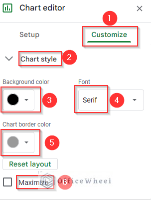
- Ultimately, you successfully edit the style of your Candlestick Chart.
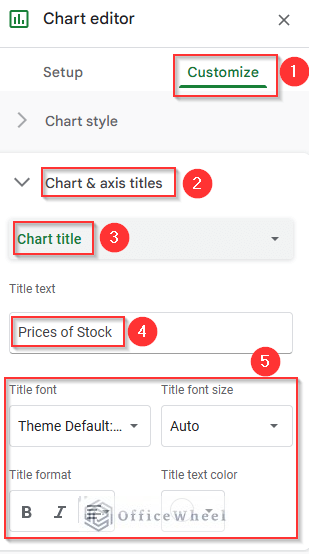
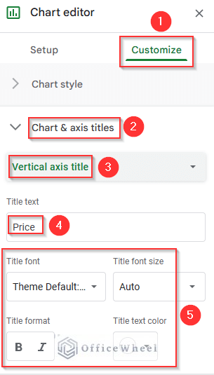
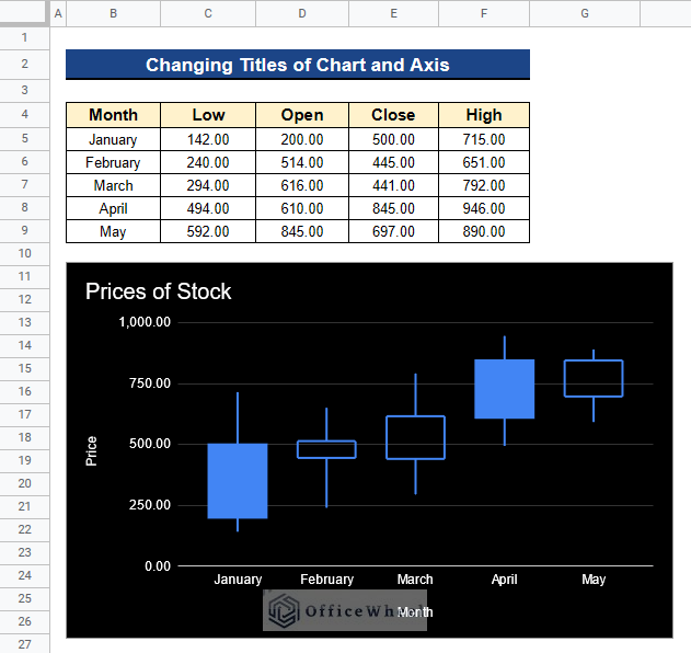
2. Changing Titles of Chart and Axis
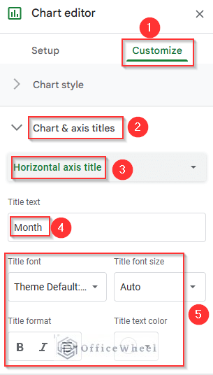
Our Candlestick Chart has a default title. But it is not clearly understood. So, we’ll change the chart title to “Prices of Stock” so that anybody can understand what is this chart about. Also, we’ll give the horizontal and vertical axis suitable titles like “Month” and “Price” respectively.
Steps:
- In the first place, open the Chart Editor window.
- Then, go to Chart & Axis Titles menu under the Customize tab.
- Select the Chart Title option and give the title as “Prices of Stock”.
- You can also change the Title Font, Font Size, Format, and Text Color from here.
- As you can see, we keep the original format.
- Now, we select the Horizontal Axis Title option and give the title as “Month” under the same Chart & Axis Titles menu and the Customize tab.
- We don’t change the rest of the format.
- Again we choose the option Vertical Axis Title and give it the name “Price” like before. Because in our Candlestick Chart, the vertical axis is representing the stock prices.
- In the end, you’ll see your Candlestick Chart with the new titles like below.
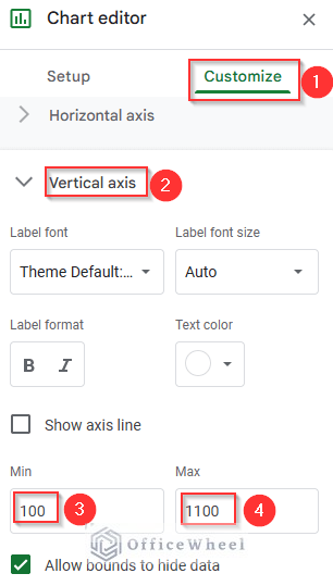
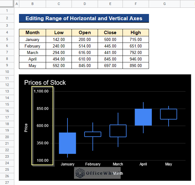
3. Editing Range of Horizontal and Vertical Axes
Our default chart range of the vertical axis is from 0 to 1000. We can change it from the Chart Editor window. We’ll change it to the range between 100 to 1100. As we have the month’s name in horizontal axes so we don’t change them. If you wish you can change them by the same procedure.
Steps:
- Before all, open the Chart Editor window and go to the Customize tab’s Vertical Axis menu after that.
- Consequently, give the Minimum value as 100 and the Maximum value as 1100. Because we want to put our Candlestick Chart in the range between 100 to 1100.
- Last but not least, you’ll see your Candlestick Chart having a new range from 100 to 1100.
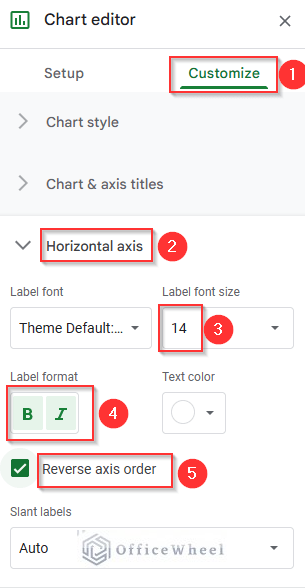
4. Changing Formats
We can also change the formats of our data labels on the Candlestick Chart easily. Apart from this, we can change the order of the axis in our chart. Our chart starts in the month of January. We’ll change it to the month of May.
Steps:
- Open the Chart Editor window first, then select the Horizontal Axis option from the Customize tab.
- As we are changing the formats of the labels so we change the Font Size to 14.
- Then, we make the Font Bold and Italic by clicking those icons.
- And we Reverse Axis Order by selecting this option.
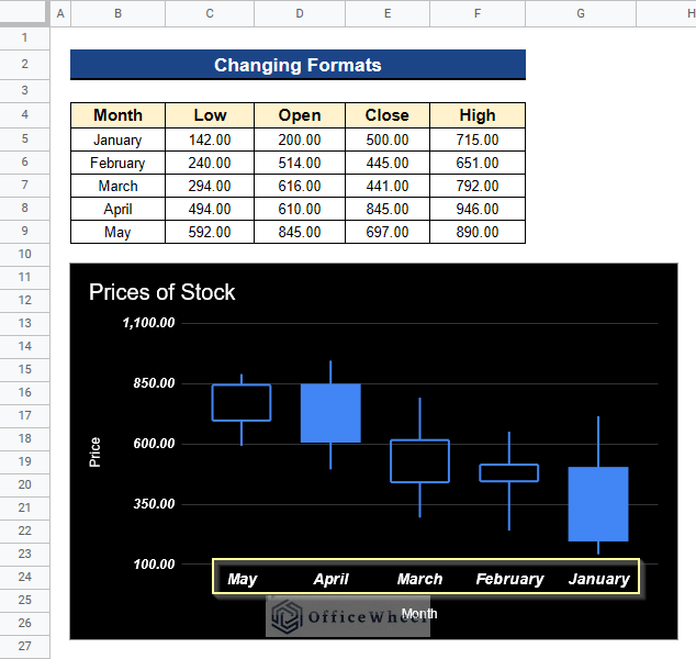
- After that, you’ll see that the formats of labels in the horizontal axis are changed.
- You may also notice the reverse order of the values as they started in May instead of January.
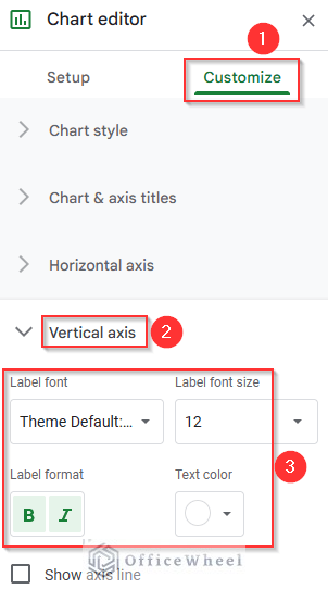
- We can also change the format of vertical axis labels by selecting the Vertical Axis option from the Customize tab.
- Then, we can change the Font Size, and make it Bold and Italic very quickly.
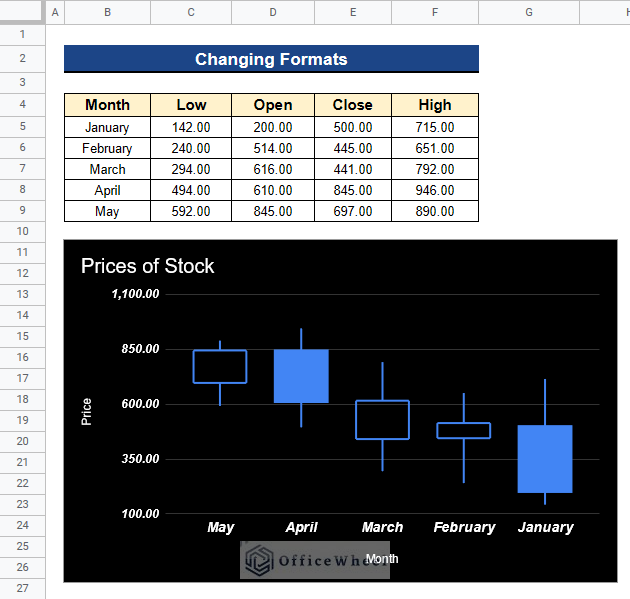
- Finally, you can see the format changes in the vertical axis also.
5. Setting Gridlines and Ticks
We can also add gridlines and ticks in our chart from the Chart Editor window. Gridlines and ticks are added for more visibility of the values of a chart.
Steps:
- Initially, go to the Chart Editor window.
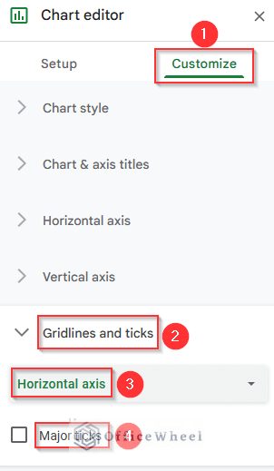
- Then, select Gridlines and Ticks menu from the Customize tab.
- Next, choose the Vertical Axis option under this Gridlines and Ticks menu.
- Now, you can choose the Major Spacing Type, Major Step, Minor Spacing Type, and Minor Count from here. We keep these defaults.
- We tick beside Major Gridlines because we want gridlines in our Candlestick Chart.
- Choose the Gridline Color Blue to make it clearly visible.
- You can also add Minor Gridlines, Major Ticks, and Minor Ticks from here as you can see in the picture. We don’t add those to our Candlestick Chart because it is unnecessary.
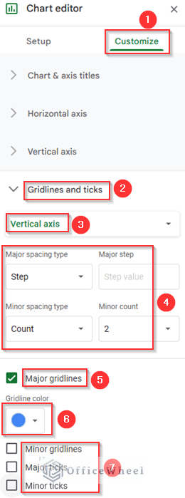
- Apart from the previous steps, you can go to the Horizontal Axis option under the Gridlines and Ticks menu and select Major Ticks to add to your chart. We also don’t add it.
- In the end, after all the modifications your Candlestick Chart will look like the following picture.
Advantages of Candlestick Chart in Google Sheets
- We can use the Candlestick Chart in any financial application like stock price movements to forecast future growth or decline.
- It provides data on the opening and closing prices in addition to the highest and lowest prices over a specific period, providing us with a complete view of the stock’s performance over that period.
- Additionally, it gives us the resources to spot stock price trends.
- To help them with their trading decisions, traders can use it to forecast the short-term direction of the prices.
- Furthermore, candlestick charts are simpler to visualize the variations between opening and closing values due to the thicker bodies of the Candlesticks.
Conclusion
That’s all for now. Thank you for reading this article. In this article, I have discussed a step-by-step guide to make Candlestick Chart in Google Sheets. I have also discussed customizing Candlestick Chart in Google Sheets. Please comment in the comment section if you have any queries about this article. You will also find different articles related to google sheets on our officewheel.com. Visit the site and explore more.