Google Sheets Pie Chart

How to Change Pie Chart Colors in Google Sheets

In Google sheets, you can present your data with great visual formatting by inserting charts. You can add and change the chart format in the easiest ...

How to Edit a Pie Chart in Google Sheets (5 Core Features)

Creating and editing pie charts in Google Sheets is a great way to visualize and understand data, particularly in the context of financial ...

How to Copy a Pie Chart from Google Sheets (5 Easy Ways)

Imagine you are working on data that represents sales or profit every month and you need to analyze those data and report the growth in percentage. ...

How to Change Title of Pie Chart on Google Sheets

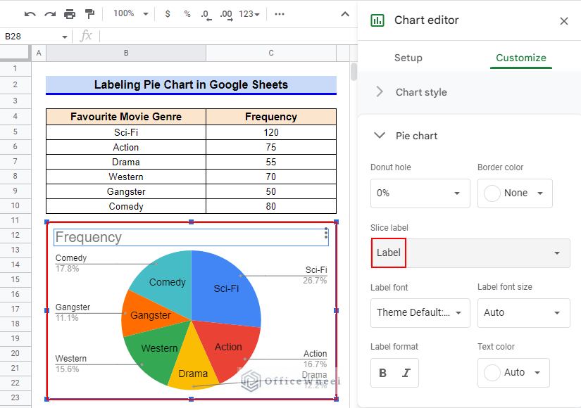
Google Sheets offers a variety of visualization possibilities, the Pie Chart being one of them. Using this tool, you may display data and understand ...

How to Change Pie Chart Percentage to Number in Google Sheets

Suppose you are working on a dataset that contains every month's sales and you need to analyze this data. Imagine how hard it could be. Because if ...

How to Make a 3D Pie Chart in Google Sheets (With Quick Steps)

“A picture is worth a thousand words”. Charts, Graphs, or Diagrams are important for better presentation, and for a better understanding of a ...

How to Label Pie Chart in Google Sheets (With Easy Steps)

We often use Pie Charts to arrange and exhibit data as a percentage or part of a whole. Creating a pie chart in Google Sheets is very simple. You can ...

OfficeWheel
Logo