We often create Charts in Google Sheets for better visualization of our data. An average line in our charts can make our visualization much better in terms of understanding the distribution of our data compared to the average value. In this article, we’ll demonstrate the step-by-step procedure to learn how to add an average line in Google sheets.
A Sample of Practice Spreadsheet
You can copy our practice spreadsheets by clicking on the following link. The spreadsheets contain an overview of the datasheet and an outline of the described ways of how to add an average line in Google Sheets.
Step-by-Step Procedure to Add Average Line in Google Sheets
Here, we’ll use the AVERAGE function to calculate the average of our given data. Next, we’ll insert a chart from the Insert ribbon. Now, let’s get started.
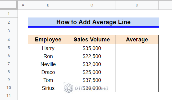
Step 1. Create a Dataset
First, we have created a dataset containing several employees’ sales volume. We want to insert a chart to visualize the sales values. However, to fully understand the distribution of the data we need to add an average line.
Read More: How to Average Cells from Different Sheets in Google Sheets
Step 2. Calculate Average
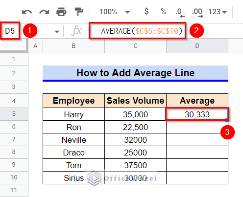
- Now, let’s calculate the average sales. For that, select Cell D5.
- Afterward, type in the following formula-
=AVERAGE($C$5:$C$10)- Then, press the Enter key to get the required average value.
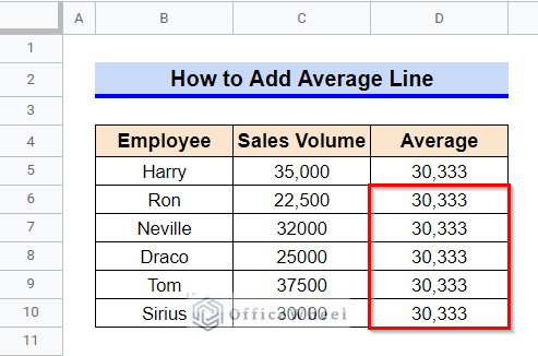
- To add an average line, we need the calculated average value in every cell of Column D in the dataset. For that, hover your mouse pointer above the bottom right corner of the selected cell. The Fill Handle icon will be visible.
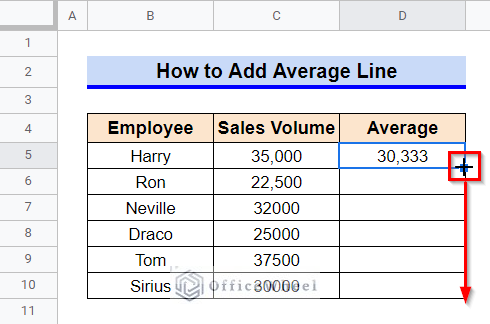
- Use the Fill Handle icon to copy the formula in other cells.
Read More: How to Find Average in Google Sheets (8 Easy Ways)
Step 3. Insert a Chart With Average Line
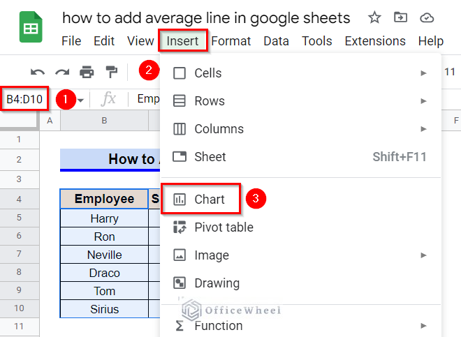
- Now, let’s enter a suitable chart for our requirements. Select the entire data table (range B4:D10) and then go to the Insert ribbon.
- From the appeared options, click on the Chart command.
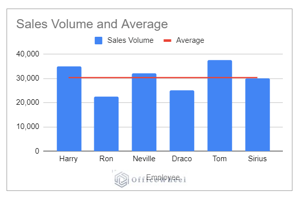
- This will open a pop-up window with a column chart. And as you can see, the chart contains an average line.
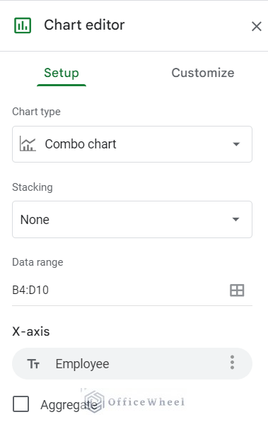
Step 4. Edit Chart If Required
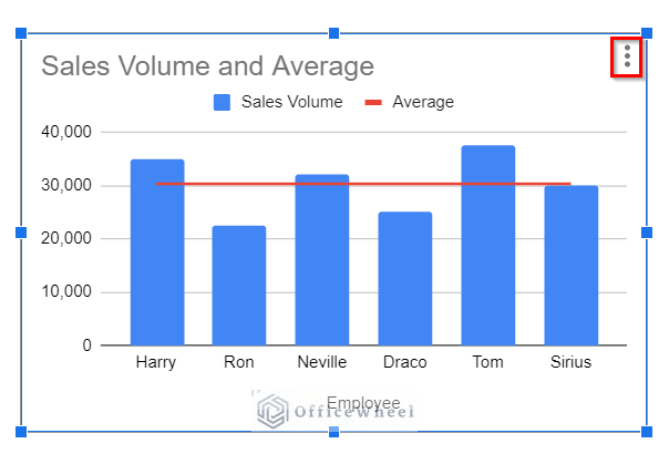
- If we require to edit the chart (for example, let’s assume we require a line chart or area chart instead of the default column chart), select the chart first and then click on the vertical ellipsis symbol (⋮).
- Now, from the pop-up options select the Edit Chart command.
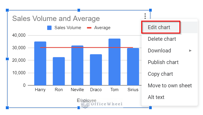
- This will open a sidebar like the following in your worksheet. Use the commands to edit the chart as per requirement.
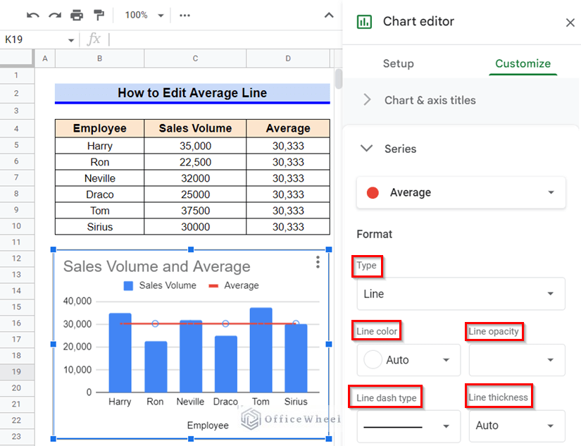
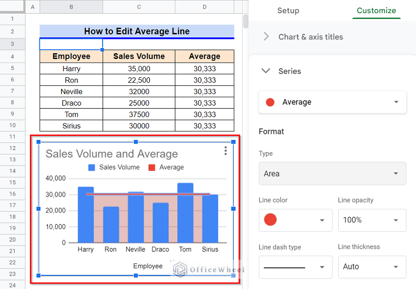
How to Edit Average Line in Google Sheets
You can also edit the average line according to your requirement. If you double-click on the Average Line, a sidebar like the following image will pop up. Several formats like type, line color, line opacity, line dash type, line thickness, etc. options that you can use to edit the average line.
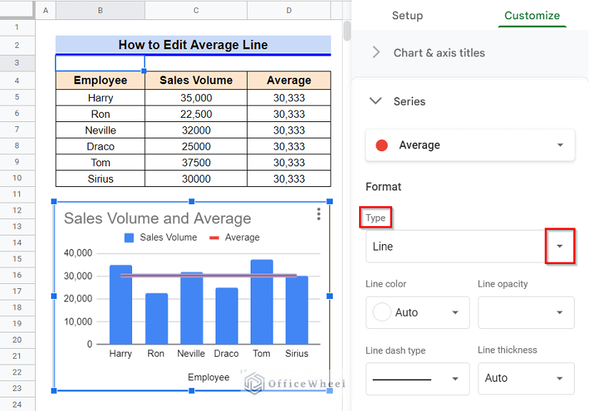
1. Edit Type
You can edit the type of the average to several other types like area, column, or stepped area. Read the following steps to know how you can edit the type.
Steps:
- First, double-click on the Average Line to open the Chart Editor.
- Later, click on the drop-down icon in the Type option.
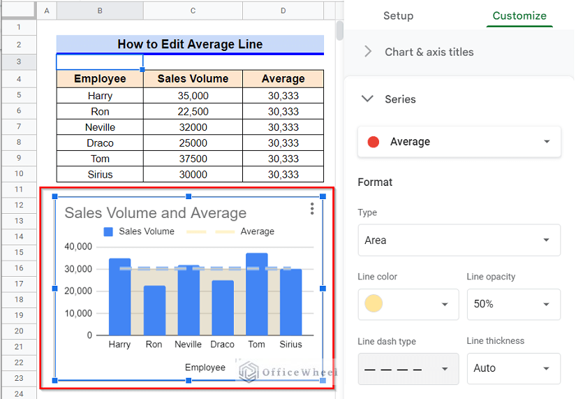
- From the appeared options, click on the chart type you want. I’ll select the type Area.
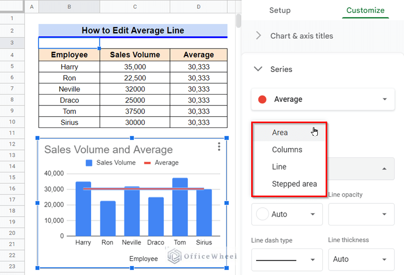
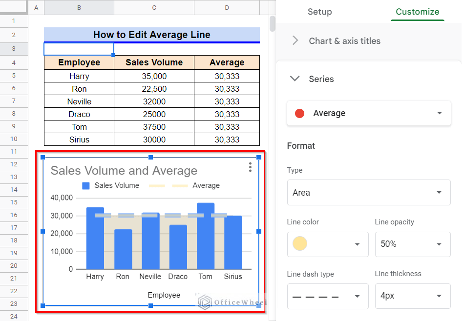
- After choosing the Area type, the average line will change like the following-
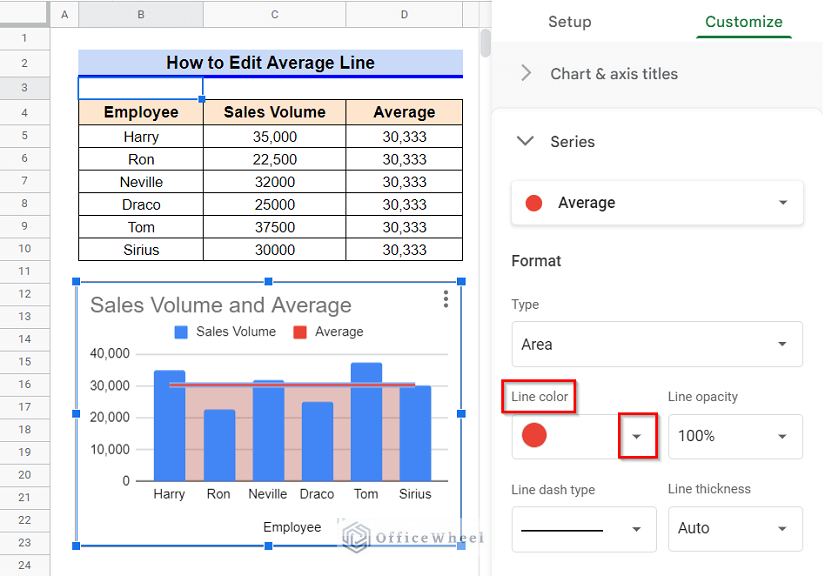
2. Change Line Color
You can also change the line color of the average line. This option is helpful when you have multiple lines.
Steps:
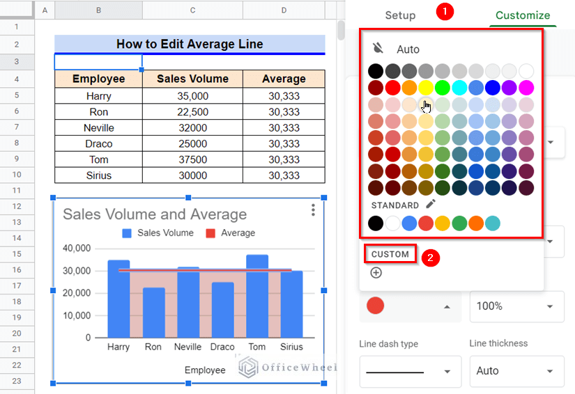
- To start, double-click on the Average Line to open the Chart Editor and then click on the drop-down icon in the Line Color option.
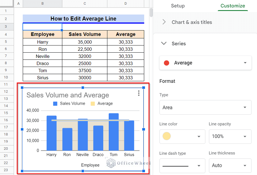
- From the appeared options, click on the chart type you want. I’ll select the Light Yellow 2 option.
- After choosing the line color as Light Yellow 2, the average line will change like the following-
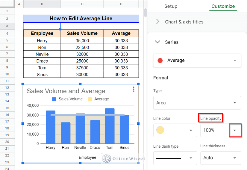
3. Change Line Opacity
We may require to change the opacity of our average line for differentiating between various lines or to represent the diminishing nature of a dataset.
Steps:
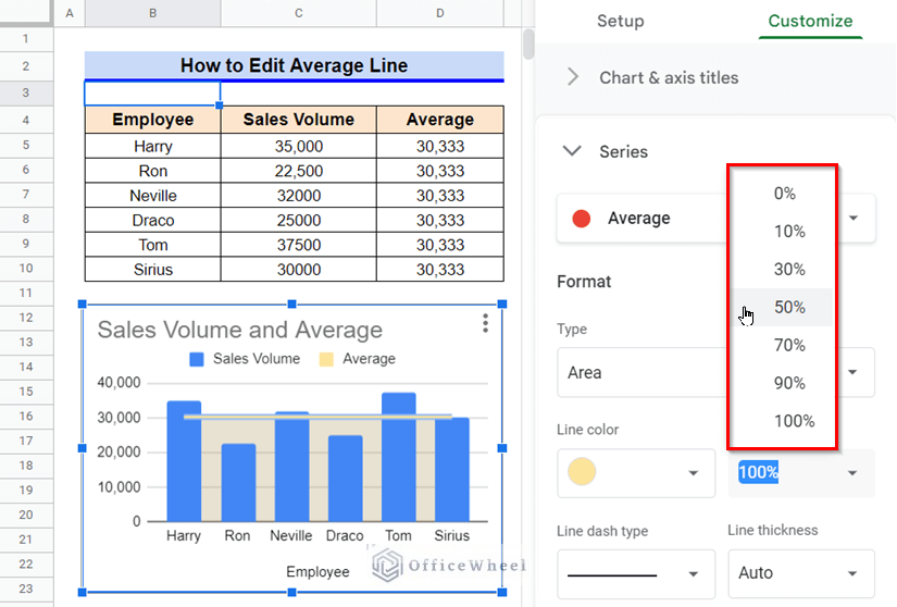
- First, open the Chart Editor by double-clicking on the Average Line and later click on the drop-down icon in the Line Opacity option.
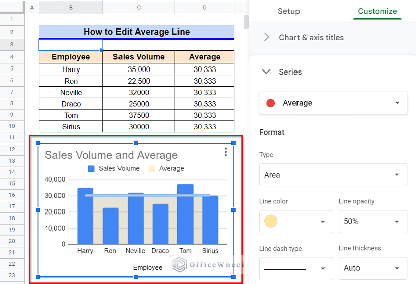
- From the appeared options, click on the chart type you want. I’ll select 50% line opacity.
- After choosing 50% line opacity, the average line will change like the following-
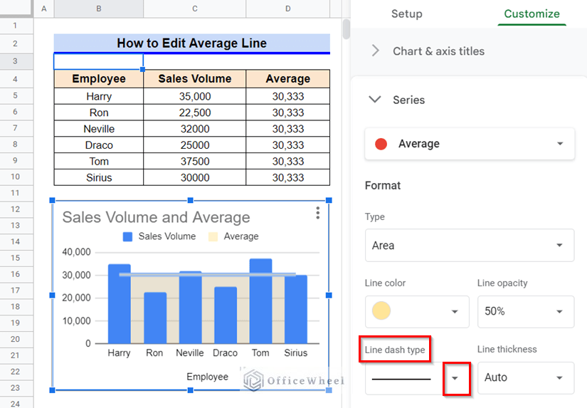
4. Edit Line Dash Type
Editing the line dash type can also help us with differentiating between several lines.
Steps:
- In the beginning, double-click on the Average Line to open the Chart Editor and then click on the drop-down icon in the Line Dash Type option.
- After that, from the appeared options, click on the chart type you want. I’ll select the Long Dash type.
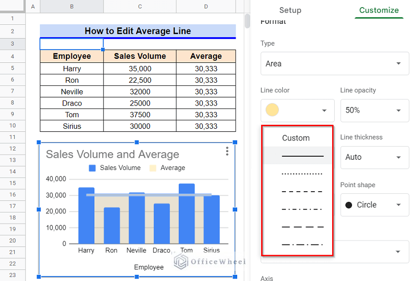
- After choosing the Long Dash type, the average line will change like the following-
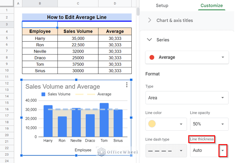
5. Modify Line Thickness
We can also change the line thickness for better visualization of a line.
Steps:
- First, open the Chart Editor by double-clicking on the Average Line, and later click on the drop-down icon in the Line Thickness option.
- Then, from the appeared options, click on the chart type you want. I’ll select the 4px line thickness.
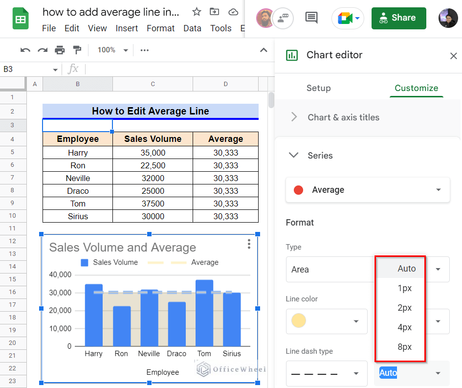
- Finally, after choosing the 4px line thickness, the average line will change like the following-
Things to Be Considered
- Since we need the same average value for the entire Column D in our dataset, you have to fix the range to average using the F4 key in your computer while employing the AVERAGE function.
Conclusion
This concludes our article to learn how to add an average line in Google Sheets. I hope the demonstrated steps were helpful in adding an average line to your chart. Feel free to leave your thoughts on the article in the comment box. Visit our website OfficeWheel.com for more helpful articles.