Sparklines are small, in-cell charts that we can use to show trends or patterns in data. They are a great way to add visual representation to your data without taking up too much space in a worksheet. With simple steps, you can easily add sparklines to your data and make your worksheets more informative and easy to understand. In this article, we will show you how to insert sparklines in Google Sheets.
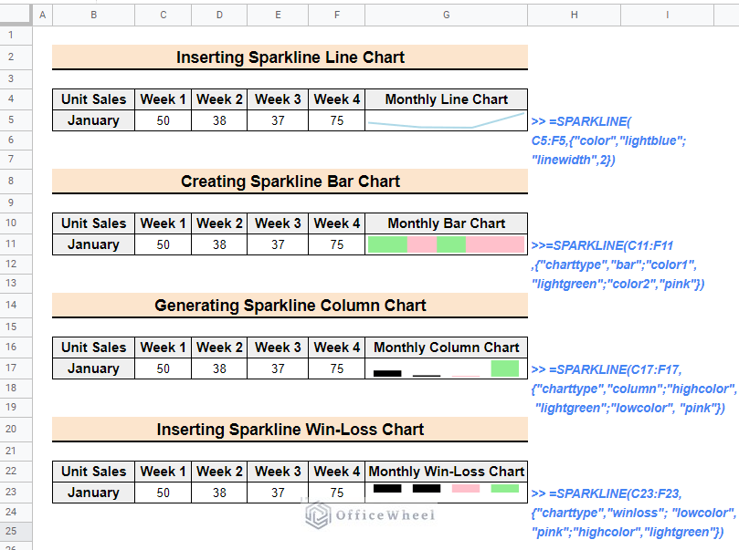
The above image is the overview of the article. Go through the article to learn step-by-step procedures to insert sparklines in Google sheets.
What Is Sparkline in Google Sheets?
Sparklines are a powerful and versatile tool for visualizing data in a compact format. They are small, in-cell charts. You can use sparklines to show trends or patterns in data without taking up too much space in a worksheet. You can insert sparklines in Google Sheets to add visual representation to the data, making it easier to understand and interpret. By following a few simple steps, one can easily create a variety of sparklines including line, bar, column, and win/loss charts.
Types of Sparklines in Google Sheets
There are four main types of sparklines in Google Sheets: Line, Bar, Column, and Win-Loss.
1. Line Sparklines: To show trends over time we use line sparklines. They are represented by a single line that connects the data points, with the height of the line indicating the value of the data point. Line sparklines can be useful for showing patterns such as an upward or downward trend.
2. Bar Sparklines: Bar Sparklines are used to display the relative size of data points. A bar is used to represent each data point. The width of the bar indicates the value of the data point. Bar sparklines are best for showing changes in data over a period of time and comparing them with each other.
3. Column Sparklines: We use Column sparklines to show changes in data over a period of time. They are great for showing changes in data over a period of time, such as daily, weekly, or monthly data. Column sparklines can be useful for showing patterns by the height of the columns.
4. Win-Loss Sparklines: Win/loss sparklines are used to show the number of wins and losses in a given data set. They are represented by a single line that alternates between positive and negative values. A positive value is represented by an upward-pointing marker, while a negative value is represented by a downward-pointing marker.
All of them allow for customizing options such as color, style, and data markers. You can choose one that is best fit for your data and purpose.
4 Useful Examples to Insert Sparklines in Google Sheets
You can easily insert different types of sparklines with just two or three simple steps using the SPARKLINE function. At the same time, you can use attributes to customize them for better understanding.
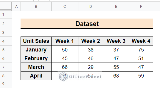
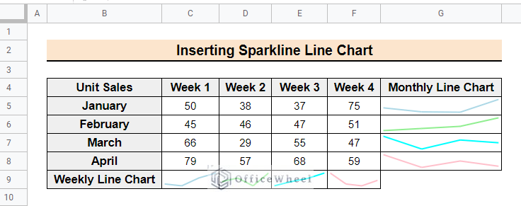
The following image is the dataset of weekly and monthly based data for unit product sales of a company. To make the data more informative and easy to understand, you have to insert sparklines for monthly and weekly comparisons.
1. Inserting Sparkline Line Chart
The line chart is the default chart of the SPARKLINE function. This sparkline shows the upward or downward trend of the data points. Follow the below steps to insert line sparklines in Google sheets.
📌 Steps:
- First, select cell G5 and enter the following formula. Here is no chart type specified because the function’s default sparkline is a line chart. For customization, the formula includes Color and linewidth to make the line light blue with a width of 2.
=SPARKLINE(C5:F5,{"color","lightblue";"linewidth",2})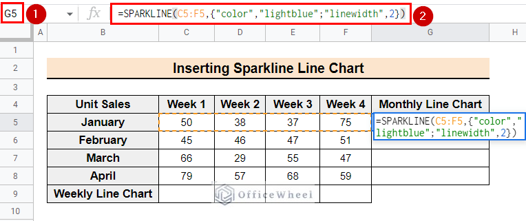
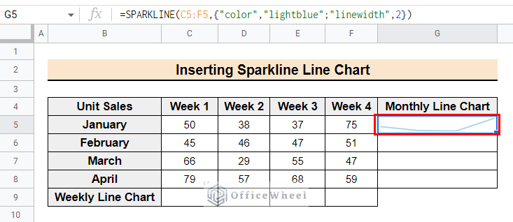
- Now the output of the function will look like the following image.
- Similarly, for the other datasets, you can declare range and customization attributes to add line sparkline.
Read More: How to Insert Formula in Google Sheets for Entire Column
2. Creating Sparkline Bar Chart
The bar sparkline indicates the relative size of the data points by the width of the bar. Follow the below steps to insert the bar sparkline in Google sheets.
📌 Steps:
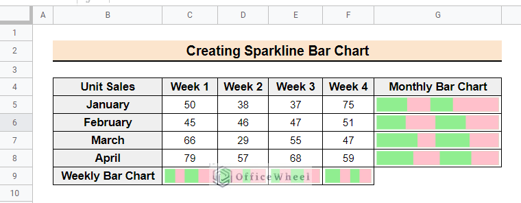
- Initially, select cell G5 of the Monthly Bar Chart column and insert the following formula. Here the charttype attribute is set to bar chart, and lightgreen and pink colors are used as the first and second colors to customize the chart.
=SPARKLINE(C5:F5,{"charttype","bar";"color1","lightgreen";"color2","pink"})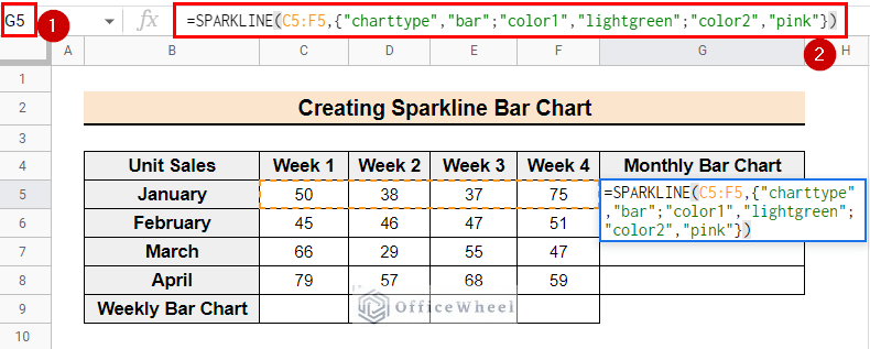
- Now, the formula will output the bar chart for the selected data range.
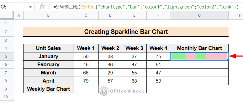
- After that, use the fill-handle tool to copy the formula to the following rows of the Monthly Bar Chart column.
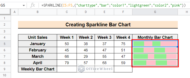
- Similarly, to include the Weekly Bar Chart, select cell C9 and insert the following formula. Then use the fill-handle tool to copy the formula to the following cells.
=SPARKLINE(C5:C8,{"charttype","bar";"color1","lightgreen";"color2","pink"})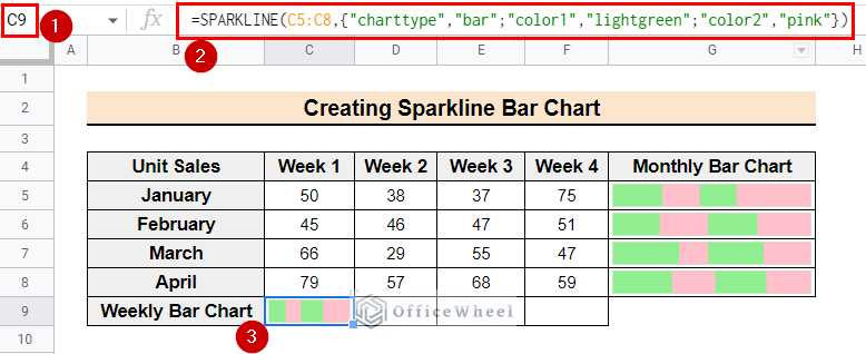
- Lastly, the final output will look like the following image.
Read More: How to Insert Error Bars in Google Sheets (3 Practical Examples)
Similar Readings
- How to Insert Video in Google Sheets (2 Easy Ways)
- Insert Serial Numbers in Google Sheets (7 Easy Ways)
- How to Insert Multiple Columns in Google Sheets (2 Quick Ways)
- Insert Multiple Rows in Google Sheets (4 Ways)
- How to Have More than 26 Columns in Google Sheets
3. Generating Sparkline Column Chart
The column sparkline indicates the trend of the dataset by the height of the columns. Follow the steps below to insert column sparklines into Google sheets.
📌 Steps:
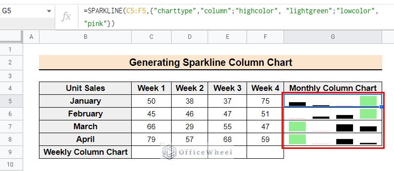
- Firstly, select cell G5 from the Monthly Column Chart column and type the following formula. Here the charttype attribute is set to a column chart, and light green and pink colors are used as the colors for the highest value and lowest value respectively to customize the chart.
=SPARKLINE(C5:F5,{"charttype","column";"highcolor", "lightgreen";"lowcolor", "pink"})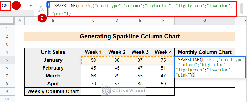
- The formula will result in the column chart for the selected data range.
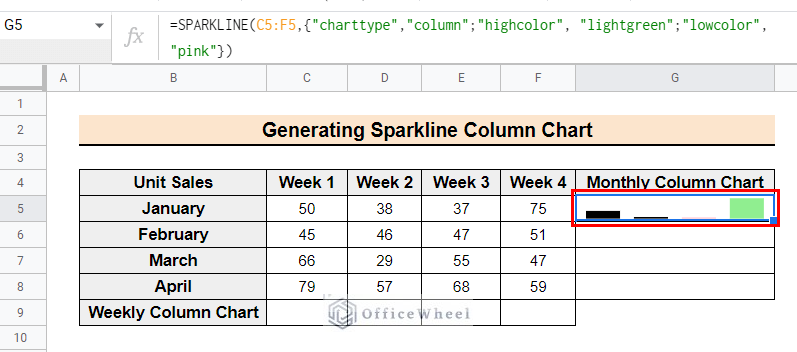
- Now use the fill-handle tool to copy the formula to the following cells of the column.
- Correspondingly, for the Weekly Column Chart select cell C9 and enter the following formula.
=SPARKLINE(C5:C8,{"charttype","column";"highcolor", "lightgreen";"lowcolor", "pink"})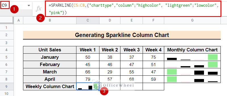
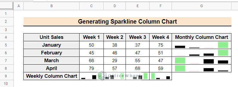
- The final outcome of the formulas will look like the following image.
Read More: How to Insert a Legend in Google Sheets (With Easy Steps)
4. Inserting Sparkline Win-loss Chart
We use the win-loss chart to show positive and negative data points. Follow the steps below.
📌 Steps:
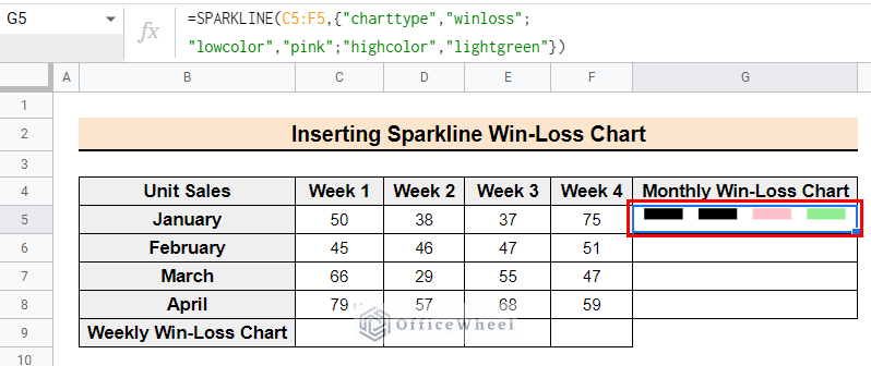
- Initially, select cell G5 of the Monthly Win-loss Chart and enter the following formula. Here the charttype attribute is set to winloss chart, and lightgreen and pink colors are used as the colors for the highest value and lowest value respectively to customize the chart.
=SPARKLINE(C5:F5,{"charttype","winloss"; "lowcolor","pink";"highcolor","lightgreen"})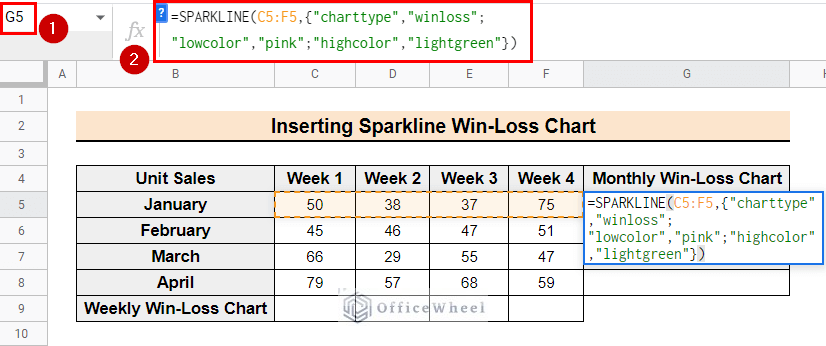
- Now, the formula will create a win-loss chart for the selected data. Here, all the data points are positive that’s why all the bars at the upward side of the cell. If there are any negative data points, the formula would place the bars for them on the downward side of the cell.
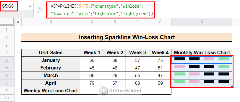
- Then, using the fill-handle tool, copy the formula to the following cells of the column. The output of the formula is similar to the following image.
- Similarly, for the Weekly Win-Loss Chart, select cell C9 and enter the following formula.
=SPARKLINE(C5:C8,{"charttype","winloss"; "lowcolor","pink";"highcolor","lightgreen"})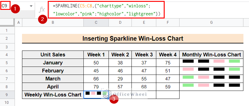
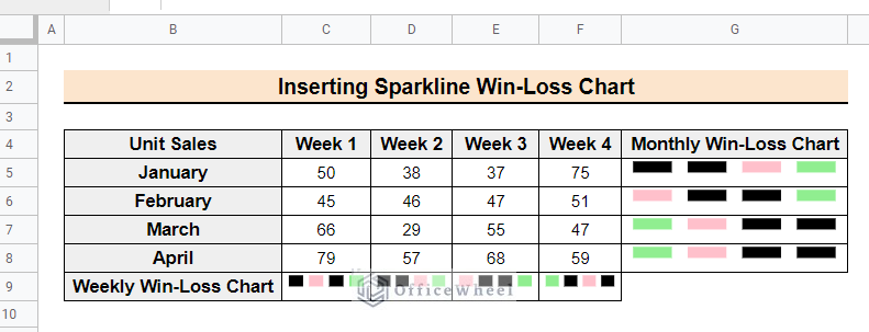
- Lastly use the fill-handle tool to copy the formula to the following cells. The final output will look like the following image.
Things to Remember
Make sure to use the correctly formatted data to create a sparkline. Sparklines only work with numerical data, so sparkling will not include any cells containing text or non-numeric data. Also, select the data range cautiously, if it includes empty cells or cells with non-numeric data, it will cause errors in the sparkline.
Conclusion
Hopefully, by following the article you can now insert sparklines in Google sheets using the SPARKLINE function. Moreover, comment below with your comments and suggestions about the article. Visit Officewheel for more spreadsheet-related helpful articles.
Related Articles
- How to Insert Superscript in Google Sheets (2 Simple Ways)
- Insert Button in Google Sheets (5 Quick Steps)
- How to Add Parentheses in Google Sheets (5 Ideal Scenarios)
- Insert Blank Column Using QUERY in Google Sheets
- How to Insert Yes or No Box in Google Sheets (2 Easy Ways)
- Insert a Drop-Down List in Google Sheets (2 Easy Ways)
- How to Insert Equation in Google Sheets (4 Tricky Ways)